A good ecommerce website helps people make a series of decisions without having to fight the interface. First they decide whether the shop has the right kind of product. Then they find a shortlist, compare the details, check availability, understand the total price and finally decide whether to buy.
Every one of those steps is a design problem. A beautiful homepage may help introduce a brand, but it cannot rescue unclear product filters, confusing variants, missing delivery information or an awkward checkout. Ecommerce website design is the entire path from discovery to purchase — not simply the colours, typography and hero photography above the fold.
This guide breaks the shopping journey into practical decisions a business owner can use when commissioning a store or evaluating a pre-designed website. It includes three original Depiction Studio concepts across fashion, pet products and home décor, with observations about what their approaches demonstrate and where production implementation still requires testing.
1. Start with what the customer is trying to buy
Different stores need different information architectures. A fashion shopper may know the product category but need to narrow by size and silhouette. A pet owner may know the animal and problem but not the best product. A home décor buyer may browse visually first and then need reassurance about dimensions, materials and delivery.
That distinction should inform homepage modules, collection navigation, filter choices and the language of product pages.
- Fashion and accessories: Prioritise category access, size and fit information, colour, product photography and returns.
- Home and interiors: Give dimensions, materials, scale, finish, lead times and room context space to work.
- Pet products: Consider animal type, size, intended use, compatibility and product durability claims.
- Beauty: Help shoppers choose shades, textures, ingredients and routines. Our separate beauty Shopify store design guide examines those specialised requirements.
- Electronics: Make specifications, compatibility, warranty and delivery clear enough for meaningful comparison.
The most important design question is not “What should the homepage look like?” It is “What does a shopper need to know next?”
2. Design the homepage as an entry point, not a catalogue dump
A homepage needs to establish the offer and provide useful routes into the range. That usually means a concise brand proposition, one strong primary shopping action, clear access to major categories and selected evidence of why the products deserve consideration.
Not every store needs a large hero slideshow. For a tight collection, one confident visual and direct “Shop the collection” action may be enough. A broad retailer may benefit from visible category tiles, popular searches or problem-led entry points.
Be selective with promotional announcements. Competing discount bars, multiple pop-ups and endless carousels can make a store feel busy while hiding the product range. If a promotion is time-sensitive, its conditions must be accurate and easy to understand.
A useful homepage should answer three questions quickly: What can I buy here? Why might it be right for me? Where do I go next?
3. Make navigation and search fit the catalogue
For most online stores, product finding begins with a small number of high-level categories. Those labels should match how customers describe the products, not internal inventory codes or poetic phrases that reveal little.
Then make filters meaningful. Size, colour, price, category, availability, material and compatibility can all be useful — but only if each one genuinely helps narrow a decision.
For example, an interiors retailer could support both “Shop lighting” and “Shop by room”, while still allowing shoppers to narrow by material or size. A fashion store may organise by garment family and provide filters for size, fit, price and colour. A pet store can let people navigate first by animal or activity.
Search matters when users know exactly what they want. A search field should handle the names customers actually type, sensible variations and common synonyms. Test zero-result states: a helpful path back to categories is better than a dead end.
Most importantly, don't create dozens of thin SEO collection pages that all lead to almost the same set of products. The category system should serve real shoppers first.
4. Treat collection pages as decision tools
A collection page is not just a beautiful grid of cards. Each card should provide enough information for a shopper to decide whether opening the full product is worthwhile.
The appropriate minimum depends on the category. Many product grids benefit from a clear name, representative image, current price, important variation or size cues, and stock or delivery information when relevant. A badge such as “New” or “Bestseller” should reflect genuine merchandising data, not permanent decoration.
Where the assortment is large, show useful filtering and sorting controls without covering the products. On mobile, make the filter panel easy to open, understand and close; the applied selections should remain visible.
A beautifully art-directed grid with no useful distinctions forces every visitor to open numerous product pages to find a suitable option. That is avoidable friction.
5. Product detail pages must answer the buying questions
The product detail page — or PDP — is one of the most consequential parts of an ecommerce website. It is where a product becomes a specific potential purchase rather than an image in a collection.
A practical PDP checklist includes:
- Identity: A precise product title and what it actually is.
- Evidence: Photographs, scale, texture, fit or functional demonstrations appropriate to the product.
- Options: Clearly labelled sizes, colours, materials and other variants, with accurate availability.
- Price: The current price and information about unavoidable fees and delivery costs.
- Specifications: Materials, measurements, compatibility, care, ingredients or technical data where relevant.
- Confidence: Straightforward returns, support and warranty details where applicable.
- Action: A clear add-to-cart or purchase control that reflects the currently selected option.
Baymard Institute's 2026 product-page UX research reports that even large ecommerce websites frequently make important product decisions unnecessarily difficult. Its research specifically flags issues such as variant selection and insufficient visibility of full order costs.
The point is not to copy every enterprise-commerce pattern. It is to make sure customers can find the information that would otherwise stop them buying.
6. Give product imagery a clear purpose
Good images help shoppers understand the product — not just admire the brand.
A strong product gallery might include a clean front view, a second angle, close-up material detail, scale or fit context, and one useful in-use photograph. For a sofa, dimensions and room scale may matter more than an atmospheric photograph. For a jacket, fit and styling may matter more than a dramatic crop. For pet equipment, size and attachment method may be essential.
Use actual product photography for a real store. Design concept imagery may communicate a visual direction, but it cannot substitute for accurate imagery of the products being sold.
Compression and responsive image delivery also matter. A gallery that looks refined on a fast desktop connection can still be frustrating when oversized images delay the first useful interaction on a phone.
7. Make the basket predictable
The cart should preserve the customer's selections and make the next step understandable. Show product, quantity, selected variant, price and any relevant delivery estimate. Let shoppers edit quantity or remove an item without unnecessary steps.
Cross-sells can be useful when they solve a relevant need, such as a compatible accessory. But an unrelated recommendation carousel should not interrupt the primary task of reviewing and completing the order.
Keep the cart summary honest. If a promotion has conditions, state them. If delivery is calculated later, don't imply that the displayed subtotal is already the final payable total.
8. Checkout is a usability and trust test
A checkout needs to make payment, delivery and the final cost clear. Avoid forcing a new account when guest checkout is a viable option for the business. Ask for information only when it is needed, mark required fields clearly and give useful error messages when something cannot be completed.
Baymard's checkout usability research identifies recurring friction around guest checkout, confusing delivery choices, unnecessary account requirements and poorly explained fields. The details of any implementation will depend on the ecommerce platform, but these are sensible buyer-focused evaluation criteria.
Do not automatically assume that a more visually elaborate checkout is a better one. It is often the clearest and least surprising checkout that provides the stronger experience.
9. For UK shoppers, total-price transparency belongs in the design
An ecommerce design aimed at the United Kingdom should not treat pricing transparency as a policy page hidden in the footer.
The UK's Competition and Markets Authority (CMA) issued updated price-transparency guidance in January 2026. It explains that businesses must present clear, complete and accurate pricing, including charges customers cannot avoid. The guidance specifically addresses drip pricing, in which mandatory charges appear later in the purchase journey.
For an online store, the design implication is practical: make product prices clear, explain delivery options early, display unavoidable fees at the appropriate point and avoid pressure tactics that misrepresent offers.
Exact tax, shipping, returns and consumer-law obligations depend on the business and products. Have the actual store policies and checkout configuration reviewed for the markets served; an attractive template cannot establish regulatory compliance by itself.
Three real Depiction Studio ecommerce approaches
The following are Depiction Studio design concepts, not proven sales-performance case studies. Each shows a different way to match the site design to the product range and brand position. Inspect them as live previews; do not assume they are finished, installable Shopify themes or that their demonstration product and checkout behaviours are production-ready.
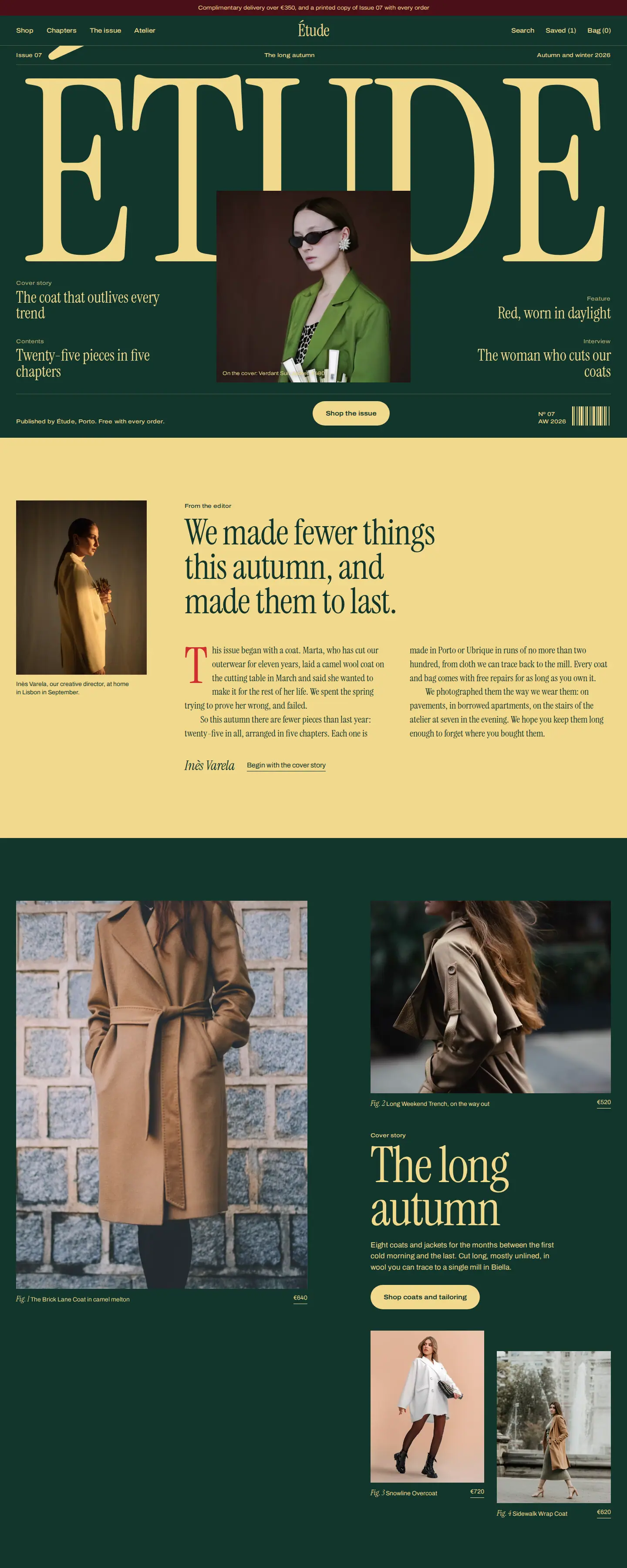
Étude: editorial fashion design with a route into shopping
Étude — Editorial Atelier approaches fashion commerce as a magazine issue. Its sections include a cover story, lookbook, product chapters, an atelier narrative and a path to shop the collection. The concept gives the clothing range a distinctive editorial frame instead of relying on a standard promotional grid.
What makes the direction useful is the relationship between storytelling and shopping. The editorial sections are not disconnected decoration: product references and collection routes give a visitor a way to move from inspiration to a specific garment. On a production store, this concept would still need real inventory, sizing, fulfilment and tested purchase flows.
Explore related fashion Shopify store designs.
Zoomies: product discovery through pet personality
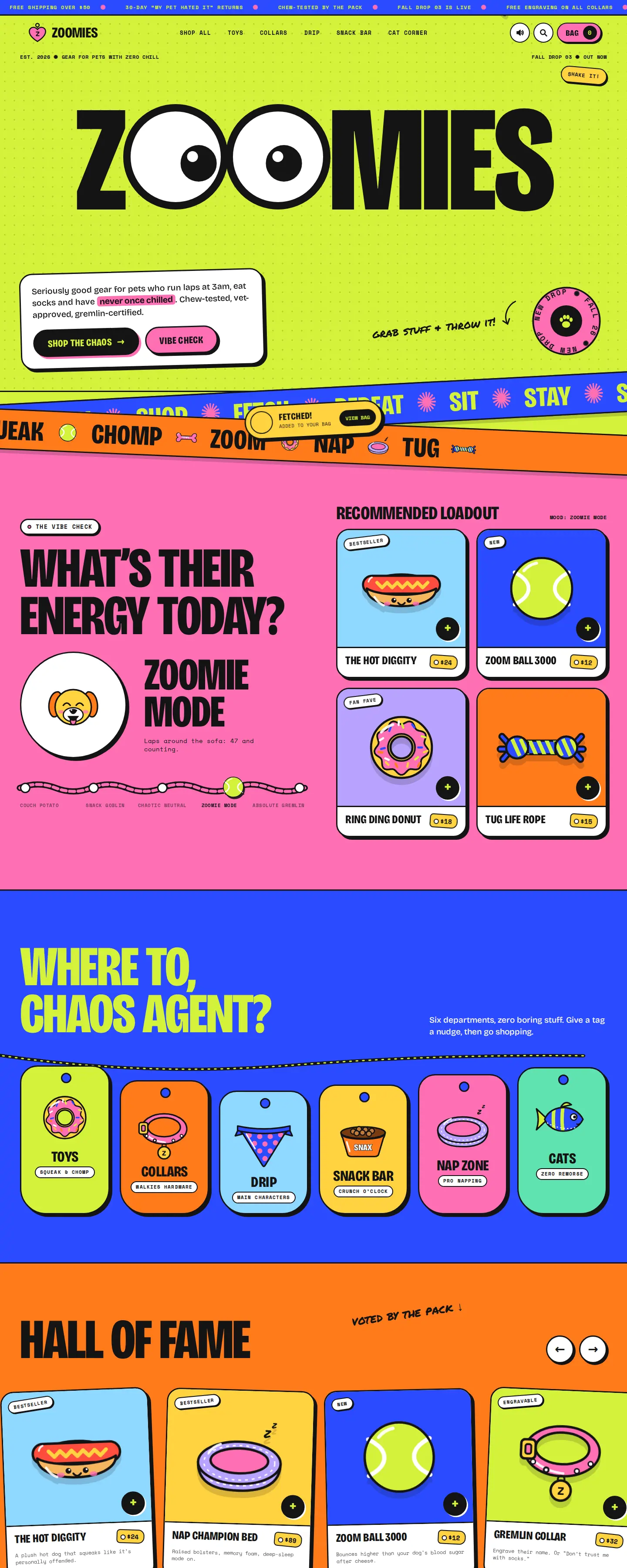
Zoomies makes a different decision. The opening proposition and modules such as “What's their energy today?” and “Recommended loadout” invite shoppers to think about a pet's behaviour before choosing products. The brand voice is deliberately expressive.
This concept demonstrates how a broad pet-products range can become easier to explore through a recognisable question. The critical production test would be whether the playful labels still lead clearly to suitable products, sizes and purchase information.
Compare other directions in the pets and kids Shopify design collection.
Vesper: home décor presented through rooms and materials
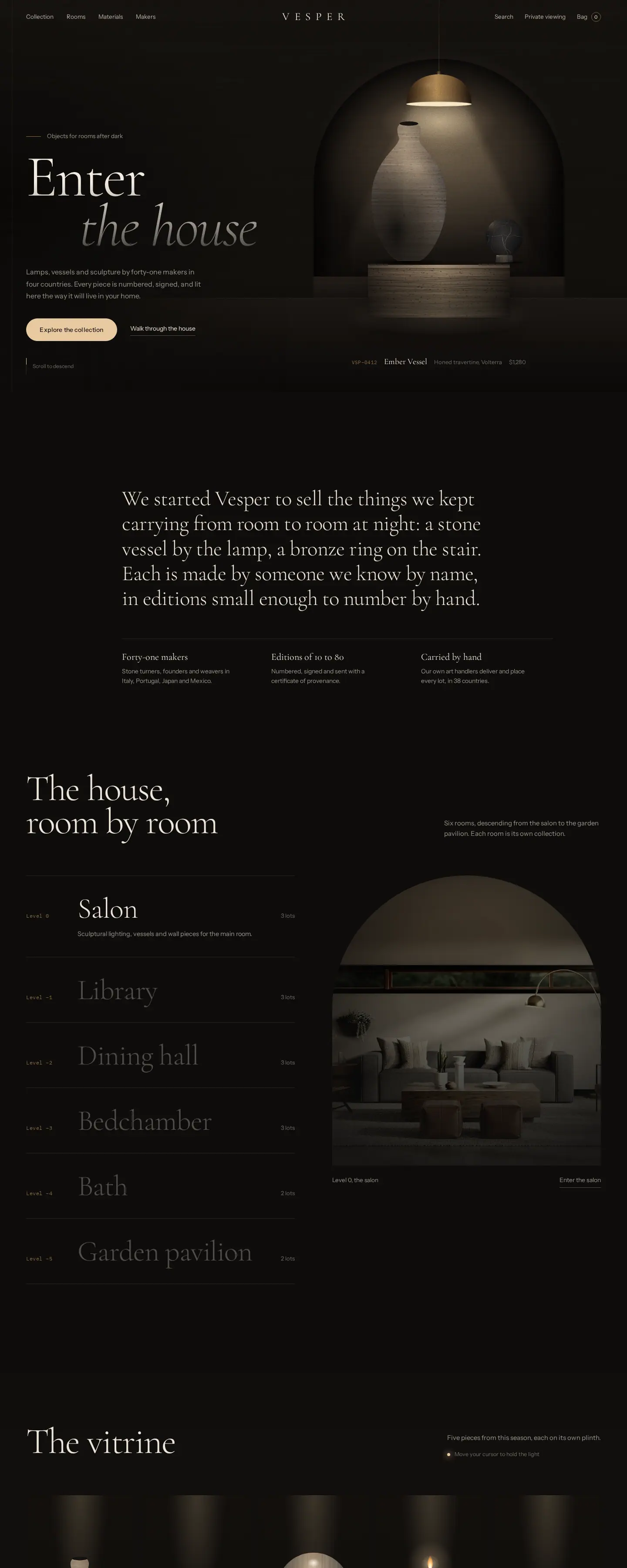
Vesper — The House After Dark puts the products in an atmospheric interior setting and supports discovery through sections such as “The house, room by room”, “By material” and “The collection”. Its product views use specific names, materials and prices.
The useful principle is context: interior products are easier to imagine when their scale and aesthetic relationships are visible. In a real store, that artistic direction must also provide reliable dimensions, specifications, availability and delivery details.
See the home and living Shopify design collection for related examples.
These three concepts are not interchangeable. Étude leads with editorial narrative, Zoomies with a buyer's pet and Vesper with a sense of place and material. Each strategy can be strong if the product decisions remain clear.
10. Mobile ecommerce design needs deliberate choices
A mobile visitor may arrive directly from search or a social link on a product page. Mobile usability is therefore about more than shrinking the desktop layout.
- Ensure categories and search are accessible without excessive menu layers.
- Keep product galleries easy to scan without hiding key information.
- Make size and variant selectors comfortable to tap and understandable with assistive technology.
- Make the current price and selected variant clear near the purchase control.
- Check how filter drawers, cart panels and sticky buttons behave in narrow viewports.
- Avoid pop-ups that obstruct product details or cannot be dismissed.
- Test the purchase journey on real devices and slower connections.
Mobile design should be reviewed with authentic product names, realistic descriptions and actual numbers of variants. Placeholder content may hide weaknesses that become obvious once the real inventory is loaded.
11. Accessibility and performance are part of the product
An online store must support visitors who navigate by keyboard, use screen readers, need larger text or find complex interactions difficult. A visually impressive site that cannot be operated without a mouse or that hides its selected product variant fails a basic usability test.
The W3C Web Content Accessibility Guidelines (WCAG) 2.2 provide a useful reference for labels, contrast, focus visibility and operable interfaces. Accessibility standards also help strengthen the everyday experience for all users.
For performance, focus on useful outcomes: optimised image files, sensible font and script loading, restrained animations and a clear first interaction. Do not install an unnecessary app or effect merely because the design supports it.
12. Ecommerce SEO begins with a coherent store structure
Search visibility is not a function of the homepage meta title alone. The platform should make category and product URLs clear, internal links crawlable and the product catalogue understandable to search engines.
Google's ecommerce search documentation covers product data, site structure, launch planning and URL architecture. For stores selling individual items, merchant-listing structured data can help Google understand product information such as price and availability when implemented correctly.
That does not mean every page should have Product schema. Use it where the markup fits the real page and follows the applicable requirements; category listing pages and editorial articles are not automatically eligible for merchant listings.
Good product names, accurate descriptions, useful categories and consistent availability are valuable both for visitors and for search systems. Avoid creating pages solely to repeat keyword variations.
13. Separate the design decision from the platform decision
Shopify, WooCommerce and custom ecommerce systems can all support useful commerce experiences, but they bring different maintenance, integration and checkout constraints.
Choose the platform based on the business's actual operational needs: catalogue complexity, fulfilment, payment methods, subscriptions, international selling, content editing and integrations. Choose the visual design based on customer needs, product presentation and brand character.
If the main question is which platform to build on, see our Shopify vs custom ecommerce website comparison. That article covers the implementation choice in detail; this guide concentrates on UX and design decisions that matter regardless of the platform.
14. What to check before buying a design or commissioning a build
When looking at a pre-designed store, test the entire experience, not only the first screenshot. Ask what the design delivers, which parts are interactive, what software it requires, how licensing works, what product data needs importing and who will connect live payment and fulfilment systems.
A design-only product and a fully configured ecommerce store are different deliverables. A studio may offer a design that you can own and adapt, or the option to commission implementation. Neither should be confused with a completed production migration, product import or live payment setup unless those services are included.
On Depiction Studio you can browse Shopify-oriented website designs, inspect the individual concepts live, and choose whether to own a design or ask the studio to customise and build it. Confirm the specific design's platform and purchase scope before proceeding.
Practical ecommerce website design checklist
- Positioning: Is it obvious what the store sells and why the selection is relevant?
- Navigation: Can people shop using categories and terms they understand?
- Collections: Are product cards, filters and sorting genuinely useful?
- Product pages: Can shoppers find photos, sizes, specifications, price and availability?
- Variants: Does the selected option stay clear through add-to-cart?
- Basket: Can quantity, selections and costs be reviewed easily?
- Checkout: Are steps minimal, fields understandable and charges transparent?
- Trust: Are delivery, returns and customer-service details accessible?
- Mobile: Do menus, galleries, filters and purchase controls work comfortably?
- Accessibility: Are core shopping interactions keyboard-operable and clearly labelled?
- Search: Are URLs, links, product data and structured markup appropriate?
- Handover: Is ownership, licence scope, catalogue loading and post-launch support clear?
Ecommerce website design FAQ
What makes a good ecommerce website design?
A strong ecommerce design helps shoppers find relevant products, evaluate them accurately, understand the total cost and complete a purchase without unnecessary obstacles. Clear navigation, useful product content, reliable mobile interactions and trustworthy delivery information matter at least as much as visual identity.
How should an ecommerce homepage be structured?
Start with a concise offer and direct category access. Then prioritise useful product discovery, relevant reasons to trust the brand and a clear primary shopping action. The exact structure should reflect the breadth of the catalogue and how customers usually shop.
Does ecommerce website design affect conversions?
Usability can remove friction from product discovery and checkout, but a particular design does not guarantee a conversion uplift. Measure changes with suitable analytics and real user tests rather than assuming an attractive redesign automatically improves sales.
Should I use a website template or custom ecommerce design?
Use a strong pre-designed direction when its structure fits the real products, variants and customer journey. A fully custom direction may be justified by unusual interactions, complex content or a differentiated product discovery model. In either case, product data, payments and fulfilment require proper production implementation.
What should a UK ecommerce website show about prices and delivery?
Prices and unavoidable charges need to be presented clearly, with delivery and other conditions accessible before a shopper commits. The CMA publishes current price-transparency guidance. Exact legal obligations should be checked for the business and product category.
Is a Depiction Studio preview already a working Shopify theme?
Not necessarily. A live design concept shows how the website can look and behave, but it is not automatically a packaged or deployable Shopify theme. Check the technology, licence and custom-build services associated with that specific design.
See the store design before choosing how to build it.
Explore Depiction Studio's ecommerce designs across fashion, home, pets and other categories. Preview a direction live, then own the design or have it customised and built for your business.
Explore ecommerce designs ↗