A beauty Shopify store has to do more than look desirable. It has to make products easy to understand when shoppers cannot feel a formula, test a shade, examine a texture or compare packaging in person. The design has to communicate the brand and then help the buyer answer a more practical question: Is this product right for me?
That is the central challenge in beauty Shopify store design. Strong editorial imagery may attract attention, but the product architecture, ingredient information, shade choices, delivery details and checkout journey are what turn that attention into a confident buying decision.
This guide explains how to structure a beauty or skincare Shopify store, what its product pages need, how to handle mobile shopping and where visual distinction should — and should not — replace clarity. It includes observations from real Depiction Studio design work, without presenting design concepts as documented conversion results.
1. Decide what kind of beauty store you are building
“Beauty” is not one shopping experience. A colour-cosmetics brand, a skincare range, a fragrance label and a multi-brand cosmetics retailer have different navigation and product-information needs.
- Skincare brand: Shoppers often compare formula, ingredient information, skin concerns, skin type, application order and routine compatibility.
- Makeup brand: Shade accuracy, coverage, finish, undertone, complexion photography and variant selection become central.
- Multi-brand beauty shop: Discovery, brand filters, product categories, availability and search can be more important than one tightly controlled editorial story.
- Fragrance brand: Scent descriptions, note families, format, size and ways to sample may deserve more space because the central characteristic cannot be experienced on-screen.
The first design decision should therefore be an information architecture decision. What does a customer need to know to navigate from the homepage to a suitable product with reasonable confidence?
2. Give the homepage a clear job
A useful beauty homepage usually needs to orient the customer, introduce the brand's point of view and provide direct paths to relevant merchandise.
For a focused skincare label, the homepage might lead with the core range, followed by routines, hero products and ingredient education. A makeup store with dozens of categories may need faster access to complexion, eyes, lips, tools and new arrivals. Neither layout is universally better.
Try to limit the number of equal-priority promotional messages in the first screen. Several competing discount ribbons, rotating slides, newsletter prompts and category cards can obscure the one decision you actually want visitors to make.
A strong starting structure is:
- Short brand proposition and one primary shopping action.
- Direct navigation to the most important product families.
- One clear reason to trust or understand the range.
- Featured products with price and availability visible.
- Useful education or a routine/shade discovery path.
- Delivery, returns and customer support information that is easy to find.
Those elements can be expressed in a minimalist or highly expressive visual style. The requirement is clarity, not a particular aesthetic.
3. Build beauty navigation around how people shop
It is tempting to create a menu from the brand's internal merchandising hierarchy. Instead, observe the decisions customers actually make.
Makeup buyers may navigate by face, eyes, lips, brows, then narrow by finish or shade. Skincare buyers might browse cleansers, serums, moisturisers or start with a routine or concern. If both paths matter, the store can offer them without duplicating hundreds of collection pages.
Collection filters should help customers narrow meaningful attributes: product format, finish, price, availability, brand, routine step or shade family, depending on the inventory. Avoid filters that are mostly empty or labels that differ only by marketing terminology.
For SEO and maintainability, use distinct collection pages where they genuinely help users. Creating near-identical pages for every keyword variation makes navigation harder and can produce thin content.
4. Beauty product pages need proof and specificity
The product detail page — often called the PDP — is where the online beauty shopper makes a judgement they would normally make in person.
A well-structured product page should answer the important buying questions before asking someone to add an item to cart:
- What is it? Specific product name, type, size or amount, and intended use.
- What does it look like? Accurate packaging photographs, texture or swatch detail and, where relevant, application imagery.
- Who is it for? Relevant skin-type, shade, finish or routine information without unsupported promises.
- What is in it? Ingredients and important warnings or directions in readable, findable sections.
- How is it used? Application instructions and sequence within a routine where relevant.
- What does it cost? Clear price, size, variant, availability and shipping/returns access.
- Can I trust the evidence? Relevant verified reviews or authentic customer images, when genuinely available.
Shopify's product-page optimisation guide also emphasises product photography, detailed descriptions, variant clarity and practical information as fundamental elements of a useful PDP.
Good product-page writing is not necessarily long. It is organised so that the buyer can find specific answers without reading an essay.
5. Show the product — not just its packaging
Beautiful packaging images are valuable for brand perception, but they do not always show how a product looks or behaves.
Depending on the product, a useful image set may include a clean pack shot, close-up texture, application in realistic light, scale or size context and a variant-accurate swatch. For cosmetics, use consistent conditions when comparing shades so that apparent colour differences are not primarily caused by editing.
For skincare, imagery should communicate consistency and use, rather than imply unverified outcomes. For makeup, show products on a meaningful range of skin tones when possible, and connect photographs clearly to the selected shade or variant.
Shopify's 2026 product-page examples highlight the value of clear variant presentation and imagery that helps a buyer understand what they will receive.
6. Separate ingredient information from marketing claims
Ingredients, usage directions and benefits should be easy to locate, particularly on skincare pages. Do not bury essential information under several decorative accordions with unclear labels.
In Australia, cosmetics are subject to mandatory ingredient-labelling requirements, and product claims must not mislead consumers. Australian Government business guidance on product labels explains the need for accurate information and cosmetics ingredient requirements. The ACCC's claims guidance explains that advertising claims must be truthful and supportable.
Design implications are straightforward: write benefits precisely; make substantiation and ingredient information accessible; distinguish cosmetic descriptions from medical or therapeutic claims; and review product-specific legal obligations before publishing. This is design and content guidance, not legal or regulatory advice.
7. Make shade and variant selection understandable
Beauty stores can have many variants: shades, finishes, sizes, fragrance options and sets. A grid of colour circles is not enough if a shopper cannot connect the name to the photograph or understand the difference between choices.
Make variant controls descriptive and keyboard accessible. Show the current choice next to the purchase action, update imagery when a relevant option changes, and communicate sold-out states accurately. If a shade finder, comparison chart or quiz genuinely helps buyers choose, test that feature carefully rather than adding it as a decorative novelty.
When users select a variant, the selected choice should remain obvious. A polished interface that makes a buyer unsure which shade is in the cart is not a successful design.
Three real Depiction Studio beauty design approaches
The following examples are from Depiction Studio's catalogue. Glowcella is a linked ecommerce storefront; Undertone and Nosy are design concept previews. They should not be confused with verified sales-performance case studies, and a visual concept is not automatically a ready-to-install Shopify theme.
Glowcella: category-led discovery for a broader beauty catalogue
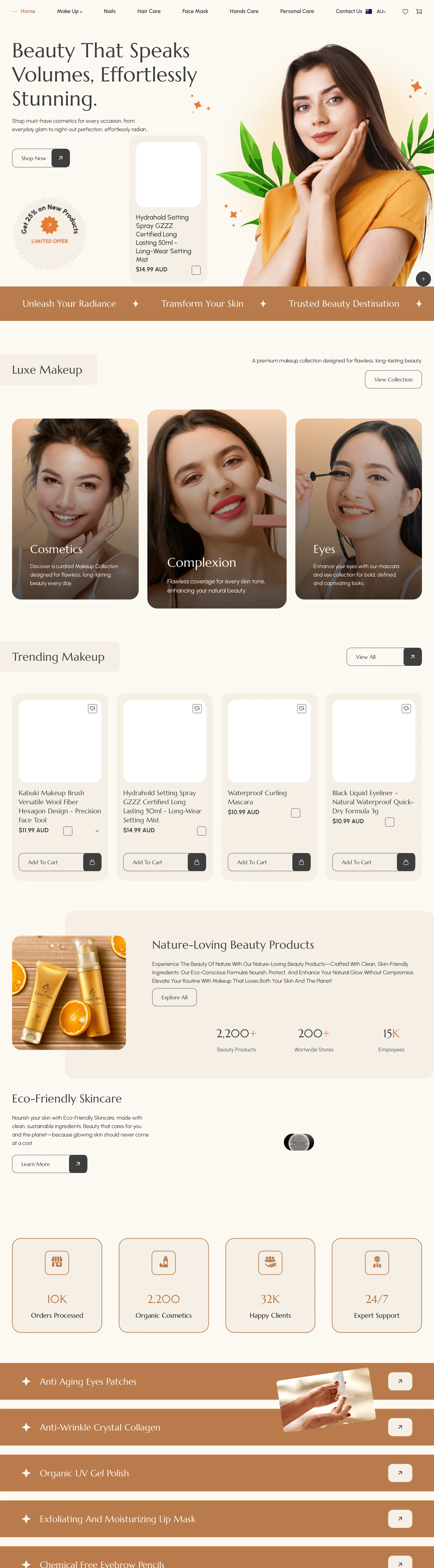
Glowcella illustrates the demands of a multi-category beauty retailer. Its navigation separates makeup areas such as Brows, Complexion, Eyes and Lips, alongside hair care and other personal-care categories. The storefront also displays prices in Australian dollars and includes cart and regional shopping controls.
The structural lesson is about navigability: when the range is broad, buyers need to find the right category quickly. It is also worth inspecting the real availability and price display rather than judging only the screenshot; clear stock states and accurate price comparisons are essential to conversion-friendly design.
View the Depiction Studio Beauty & Skincare collection to explore the design direction in context.
Undertone: a makeup concept centred on shade discovery
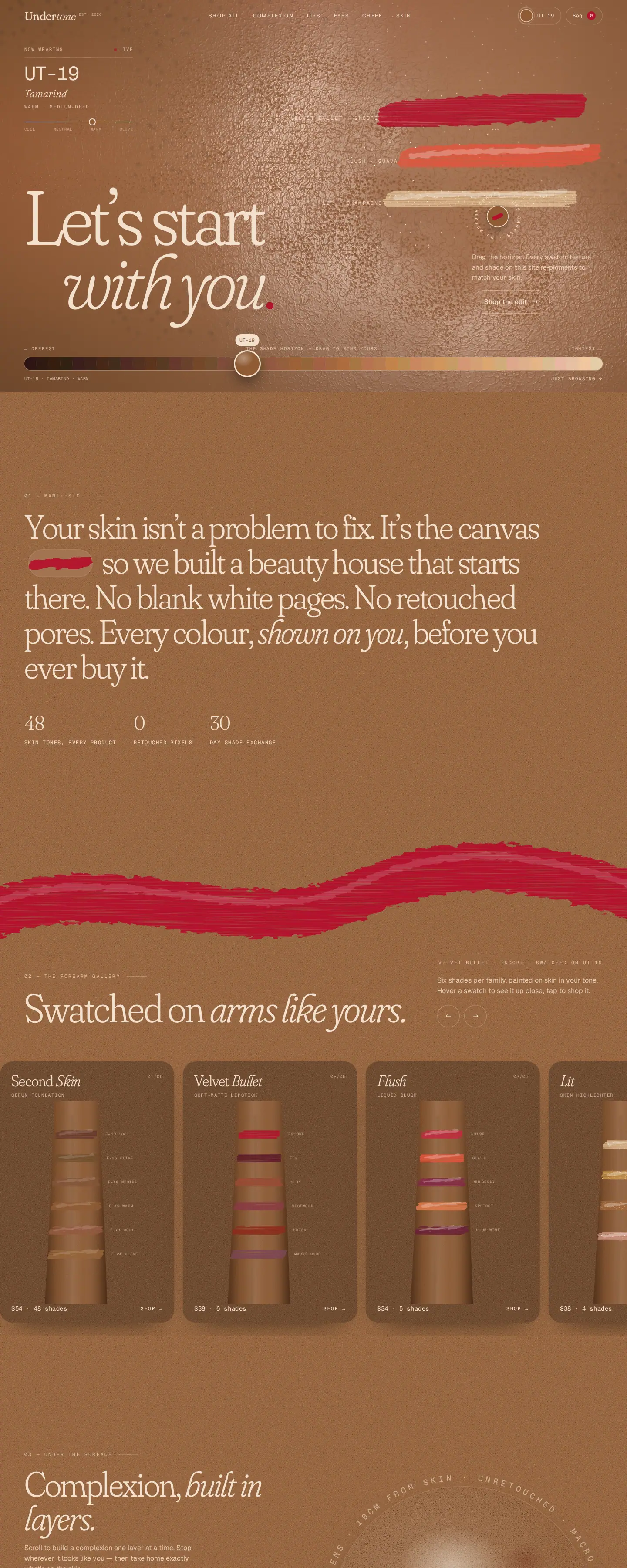
Undertone takes a different approach. Its language and page structure foreground complexion and shade selection, including concepts such as a “Shade passport” and swatches on different skin tones. This makes the buyer's decision — finding a suitable colour — the central design idea rather than an afterthought on a generic product page.
The lesson is not that every makeup brand needs a shade quiz. It is that the interaction design should reflect the most consequential product choice. A concept also needs production testing, real catalogue data and appropriate platform implementation before it can be treated as a live ecommerce experience.
Nosy: personality-led editorial commerce
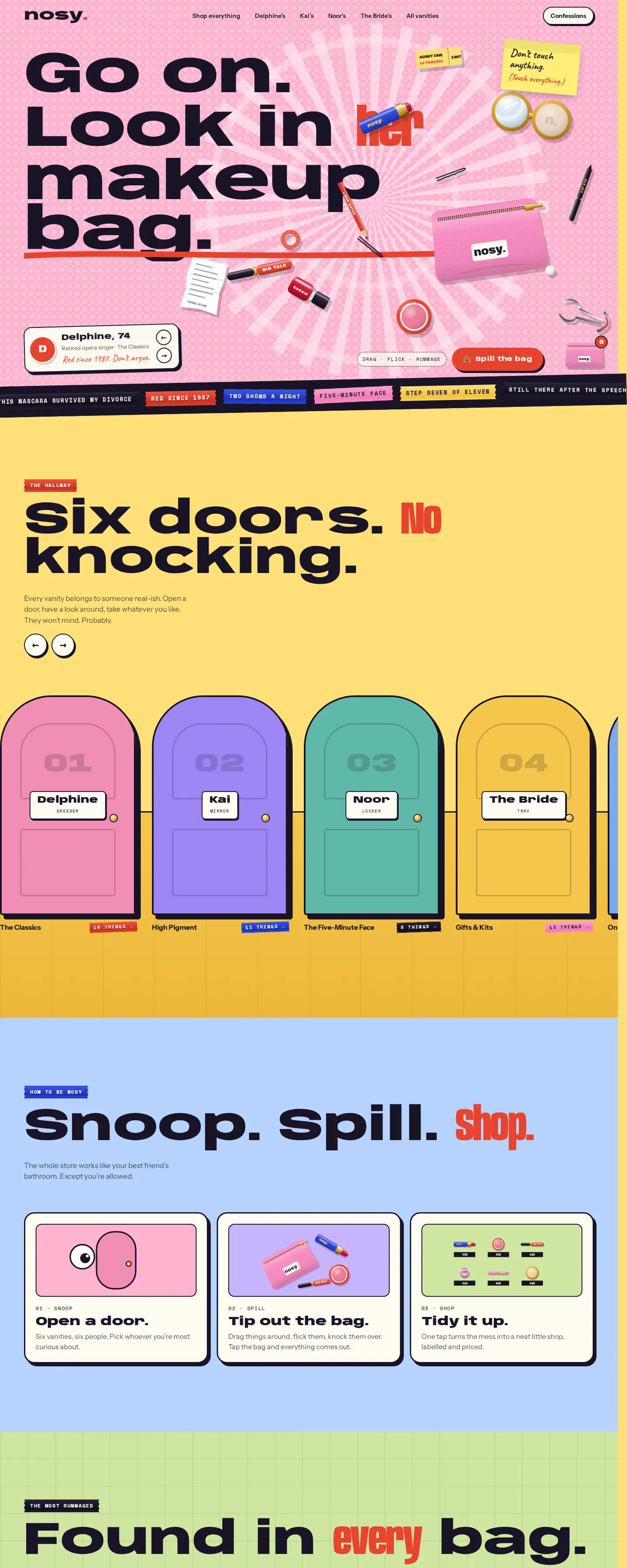
Nosy is built around the idea of looking inside someone's makeup bag. Sections such as “Six doors. No knocking.” and “Snoop. Spill. Shop.” express an unusually strong point of view.
That kind of creative navigation can differentiate a brand, but novelty still has to be checked against usability. A playful heading should not prevent shoppers from knowing what is available, what a product costs or how to buy it. Brand voice and shopping clarity should reinforce each other.
You can compare these directions with more makeup website design concepts in the catalogue.
8. Make mobile shopping a first-class experience
Beauty shoppers often discover products through social content, then arrive directly on a product page rather than the homepage. The small-screen product experience therefore deserves as much attention as the landing page.
Check the following on a real phone:
- Product imagery is legible and the image sequence makes sense.
- Variant selectors do not require tiny taps or difficult horizontal swipes.
- The price and selected variant stay understandable near the purchase action.
- Ingredient, usage and delivery information can be opened without losing place.
- Cart actions do not cover product information or accessibility controls.
- Sticky add-to-cart elements do not consume excessive viewport height.
- Navigation, filter sheets and search can all be closed predictably.
- Discounts and subscription options are described clearly before checkout.
A responsive design is not simply a desktop layout squeezed to fit. Mobile requires its own hierarchy and interaction decisions.
9. Use reviews and social content carefully
Customer photos, reviews and product demonstrations can help buyers evaluate colour, texture and use. But the content should be genuine, clearly presented and relevant to the specific item.
Don't fill a new store with invented five-star testimonials or present concept-store placeholder reviews as real customer evidence. Where reviews are collected, explain relevant context such as shade, finish or product type when appropriate, while handling personal information carefully.
In Australia, the ACCC notes that online reviews and product claims are also subject to consumer-law requirements. Its online shopping guidance is a useful reference when planning trust signals and customer information.
10. Subscriptions, bundles and routines should earn their complexity
Repeat-purchase skincare products may suit replenishment subscriptions. A routine-builder or bundle can help customers choose products in the right order. But these features add operational and interaction complexity.
Before installing an app or designing a custom flow, ask whether customers really need it, whether prices and renewal terms are clear, how easily the shopper can select a one-time purchase, and whether the feature works well on mobile. More features can increase friction if they are difficult to understand.
The best ecommerce features solve a recurring customer question. They do not exist merely to make a store look technologically advanced.
11. Make delivery, returns and contact information visible
A beauty buyer may need to know where an order ships from, whether products are eligible for return, and how to resolve an issue. Those details should be easy to reach from product pages and the cart, without pretending every product has the same return conditions.
For an Australian store, be clear about prices in AUD, shipping estimates, applicable delivery regions, any special conditions and the business's contact route. Legal rights and store policies are not interchangeable: publish accurate policies that fit the actual business and applicable law.
12. Choose the right Shopify design starting point
Some stores can begin with a well-structured pre-designed direction; others need a more tailored build. Ask whether the proposed design supports your actual collection count, variant types, content depth, mobile workflow, imagery and any specialist discovery features.
Also distinguish the visual direction from the Shopify implementation. A live HTML concept or design preview can help you choose the look and information hierarchy, but a production Shopify store still requires theme integration, real products, payments, policies and testing.
For a broader explanation of the technical trade-offs, see Shopify vs a custom ecommerce website. The platform decision should be made separately from the question of whether the store's visual design looks right.
Beauty Shopify store pre-launch checklist
- Homepage: Is the brand proposition clear, and can visitors enter useful categories quickly?
- Collections: Do filters and navigation reflect actual shopper decisions?
- Product content: Are title, price, size, availability, ingredients and usage accurate?
- Images: Are swatches, finishes or textures represented consistently and honestly?
- Variants: Is the selected option clear, accessible and connected to the right image?
- Trust: Are reviews authentic and shipping/returns details easy to find?
- Mobile: Can a visitor navigate, select and add to cart without friction?
- Claims: Have cosmetic-benefit statements and ingredient information been reviewed?
- Checkout: Do payment, shipping and tax configurations work with real test orders?
- Performance: Are large images optimised and unnecessary apps minimised?
Beauty Shopify store design FAQ
What should a beauty Shopify store include?
At minimum, a clear category structure, compelling and accurate product photography, useful product details, understandable variants, pricing and availability, delivery and returns information, and a reliable mobile shopping path. Makeup and skincare stores may also need shade or routine guidance.
Is a minimalist design best for a skincare Shopify store?
Not necessarily. Minimalism can work when product photography and hierarchy are strong, but an expressive editorial design can also work. Choose a style that fits the brand and still makes product information and purchase actions easy to find.
How should I display skincare ingredients?
Make the ingredient information easy to find, readable and consistent with accurate product labelling and applicable requirements. Avoid presenting vague marketing claims as scientific evidence. For Australian sales, review the relevant cosmetics requirements rather than relying only on a theme's default product tabs.
Do I need a shade finder?
Only when the product range and buyer questions justify one. A compact, well-labelled shade selector with accurate photos may be more useful than an elaborate quiz that is hard to maintain. Test the selection path with real products and shoppers.
Can I use a Depiction Studio concept as a Shopify store?
Depiction Studio provides website design directions you can preview before choosing. Confirm the specific design's technology, licence and implementation scope before purchasing: a visual HTML preview is not necessarily an installable Shopify theme. A finished Shopify store also requires catalogue setup, configuration and launch testing.
Find a visual direction that makes your products easier to choose.
Compare Depiction Studio's beauty and makeup website designs live. Choose a direction, then check the ownership, platform and customisation options for your store.
Explore beauty & skincare designs ↗