Fashion is one of the hardest ecommerce categories to sell through a screen. Customers cannot try the garment on, compare fabrics by touch or see how an item moves on their own body. A compelling campaign image helps them imagine the look. But the actual purchase decision depends on something more specific: confidence about fit, material, size, delivery and returns.
That makes fashion Shopify store design different from a general online shop. Fashion brands need visual identity and editorial direction, but they also need product information that prevents shoppers from second-guessing a choice. A minimalist storefront that hides sizes can be just as frustrating as a maximalist design that overwhelms the buyer with decoration.
This guide explains how to structure the homepage, collections, product pages and mobile shopping journey of a fashion store. It also examines three distinct fashion website directions from the Depiction Studio women's fashion collection—including live storefront and design concept examples—without making unverified performance claims.
Begin with the fashion customer, not the theme
Before choosing a Shopify theme or commissioning a custom visual design, identify the shopping problem. A boutique occasionwear label, a size-inclusive everyday fashion brand and a fashion editorial house may sell clothing, but they ask customers to browse in different ways.
A capsule wardrobe brand might emphasise versatile looks, fabric and styling combinations. A trend-focused store needs fast new-arrival discovery. A premium occasionwear label may rely on garment details, silhouette and styling context. A multi-category clothing retailer needs a stronger search and filtering system.
Write a one-sentence design brief stating who is buying, what they are deciding and what evidence they need before purchase. This is more useful than asking a designer for “a luxury Shopify store” without defining the buyer.
1. Make the homepage a clear fashion edit
The homepage should introduce the brand's visual world while making it immediately obvious how to shop. For many fashion retailers, the opening screen needs just three things: a specific proposition, a distinctive visual and a clear route into a relevant collection.
A hero image can express mood, silhouette and attitude. But the accompanying text should not be so abstract that a new shopper cannot tell whether the store sells dresses, streetwear, activewear or accessories. A headline such as “New Season Tailoring” communicates a useful product direction; a beautifully typeset slogan without any product context may not.
Below the opening visual, give shoppers useful entrances into the range. These might be New Arrivals, Dresses, Sets, Outerwear, Best Sellers or Shop by Occasion. The priority should reflect actual merchandise and shopping behaviour, not a standard template's default section order.
Do not use five promotional messages of equal weight. A discount banner, newsletter takeover, rotating slider, countdown and floating coupon can obscure the products. A restrained editorial experience often depends as much on what is removed as what is added.
2. Organise fashion collections around shopping decisions
Effective collection pages bridge brand storytelling and precise product finding. Start with a taxonomy shoppers recognise: Dresses, Tops, Trousers, Knitwear or Shoes. Then provide filters that are genuinely helpful for the range.
- Size: Only show sizes the brand actually sells, and make availability accurate.
- Fit or silhouette: Slim, relaxed, oversized, straight-leg or other meaningful characteristics.
- Colour: Use understandable names and avoid inconsistent labels for the same colour family.
- Material: Linen, cotton, wool, denim and other relevant fibre or finish information.
- Occasion: Workwear, holiday, evening or everyday when these are genuine navigation needs.
- Price and availability: Make it easy to narrow a shortlist without opening every item.
Shoppers may browse by product type on one visit and by styling need on another. Both routes can coexist when collections and filters are well organised. Avoid creating many near-identical SEO collections simply to target slightly different keyword phrases; that can make the site harder to navigate and maintain.
3. Fashion product pages must make fit legible
The garment product page is where desire becomes a practical question: “Will this actually fit me?” Design should treat that question as central, not hide it near the bottom.
Baymard Institute's apparel UX research identifies sizing information and size-selection controls among frequent weaknesses on apparel websites. Its findings underscore why a fashion store needs more than attractive photography.
Provide a findable size guide with actual measurements and a clear explanation of how the garment is intended to fit. When available, include model height and worn size. Say whether an item runs relaxed, slim or true-to-size only when that assessment is substantiated by the product itself.
For garments with meaningful differences in cut, add specific fit notes: rise, inseam, length, stretch, neckline, sleeve or body measurements as relevant. A generic chart repeated across unrelated silhouettes may create false confidence.
If sizes are available, show them as clearly labelled selectable options instead of relying only on a closed dropdown. Make out-of-stock sizes visible and unselectable rather than allowing customers to discover unavailability after clicking Add to Bag.
4. Use photographs that answer the buyer's questions
A fashion photo gallery should help a shopper judge the actual garment. The ideal set depends on the product, but it often includes a front view, back view, close-up fabric detail, a full-body model image and a context or styling shot.
For trousers, show rise and leg shape. For outerwear, reveal the closure, silhouette and lining or material. For dresses, show length and how the fabric drapes. For shoes, show side, front, sole and scale. Product images should remain colour-accurate and consistent across the set.
Baymard's apparel shopping research specifically discusses the importance of sufficiently detailed sizing information and imagery with garments worn by human models.
Editorial photography still matters, especially for brand positioning, but it should complement product-evaluation images rather than replace them. A dramatic crop of a sleeve is an excellent art-direction moment and a poor substitute for a complete view of the jacket.
5. Keep colour, size and stock states connected
Variant selection is a common source of avoidable friction. If a customer selects a different colour, the images should correspond to that colour when imagery is available. If the selected size is sold out, the state should be explicit. The add-to-cart action should always represent the exact variant the customer has selected.
For example, a dress in four colours and six sizes has more possible variants than a single “Select your size” control suggests. The experience should account for combinations that are unavailable without misleading the shopper.
Make selection accessible with readable labels, focus indicators and tap targets that work on mobile. Don't use colour alone to identify an option; name the colour too. Customers should be able to tell which size and colour they chose when they review the basket.
From an SEO perspective, Google provides specific documentation for product variant structured data. It explains how related colours, sizes and materials can be represented with Product and ProductGroup data where the page and platform implementation meet the requirements. Schema must reflect real product information; simply adding markup does not make a design or demonstration storefront eligible for merchant listings.
6. Give fabric and care details enough space
In fashion, material information is a major part of the product value. Don't hide it in a marketing paragraph with vague words such as “premium”, “soft” or “luxury”. State the actual fibre composition when it is known, alongside care instructions and other characteristics that affect the decision.
Depending on the garment, relevant notes can include lining, transparency, stretch, weight, construction, closure type and wash or dry-clean requirements. When a designer plans the product detail page, these should be structured fields rather than handwritten fragments pasted into an unscannable description.
This is also a brand opportunity. Clear, precise details often convey more confidence than decorative claims. A sophisticated product experience can feel quieter because the information is organised well.
7. Make returns and shipping easy to find before checkout
Clothing purchases carry the risk of incorrect fit. Buyers therefore need access to the actual return policy before paying, especially where special rules apply to sale items, underwear or personalised goods.
Show a short and accurate delivery/returns summary near the buying decision, linking to the full policy. Avoid promises such as “free returns”, “fast delivery” or “easy exchanges” unless those terms are truly offered and the conditions are clear.
For US-facing stores, the Federal Trade Commission's guidance on Made in USA claims is an example of how fashion-related marketing statements can have specific substantiation requirements. A design team should never invent origin, sustainability or manufacturing credentials for placeholder copy; actual businesses need to validate the claims they publish.
Three Depiction Studio fashion design directions
To show how visual language changes the shopping experience, consider three distinct designs from the Depiction Studio catalogue. These examples illustrate design decisions, not verified client conversion studies. A visual concept also does not automatically mean that a complete Shopify theme, product catalogue, payment flow and fulfilment integration have been delivered.
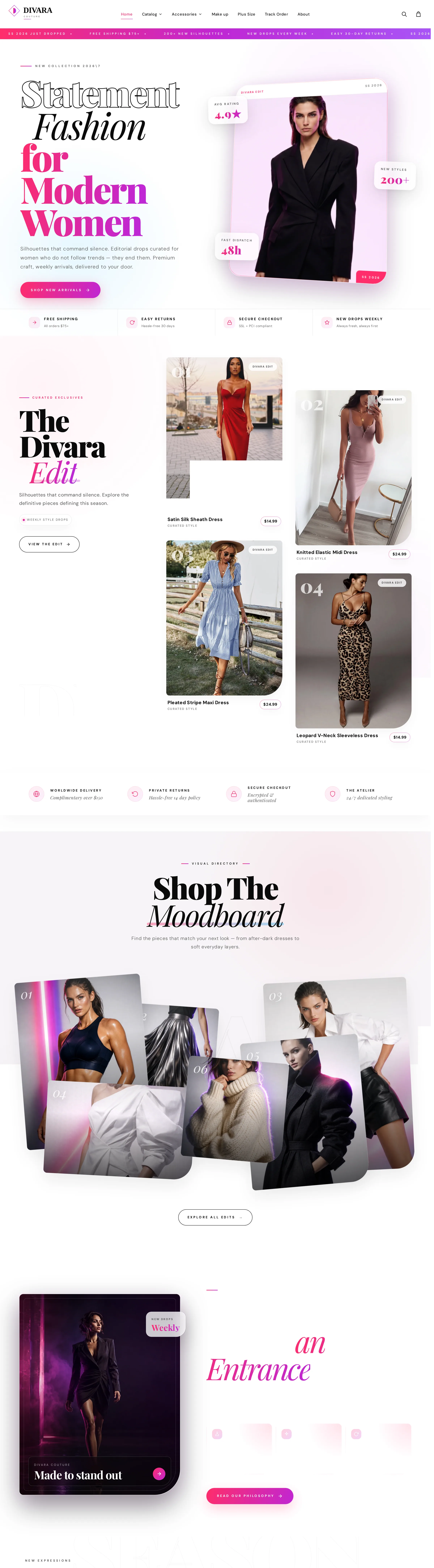
Divara Couture: polished editorial commerce
Divara Couture is a linked fashion storefront with an editorial homepage, seasonal collection narrative, featured products and shop-by-mood pathways. Its visual approach uses fashion photography to establish a polished identity, while product category links offer practical ways into the range.
One distinctive element is its “Where Are You Going?” shopping concept, which presents styling moods as entry points. This can work when the destination leads to a relevant selection of products. It should complement, not replace, straightforward categories such as Dresses or Trousers.
For a production fashion site, all visible testimonials, discounts, delivery promises and product attributes must be authentic and accurate. A screenshot or sample design is not evidence that those claims have been independently verified.
Étude: fashion collections as an editorial issue
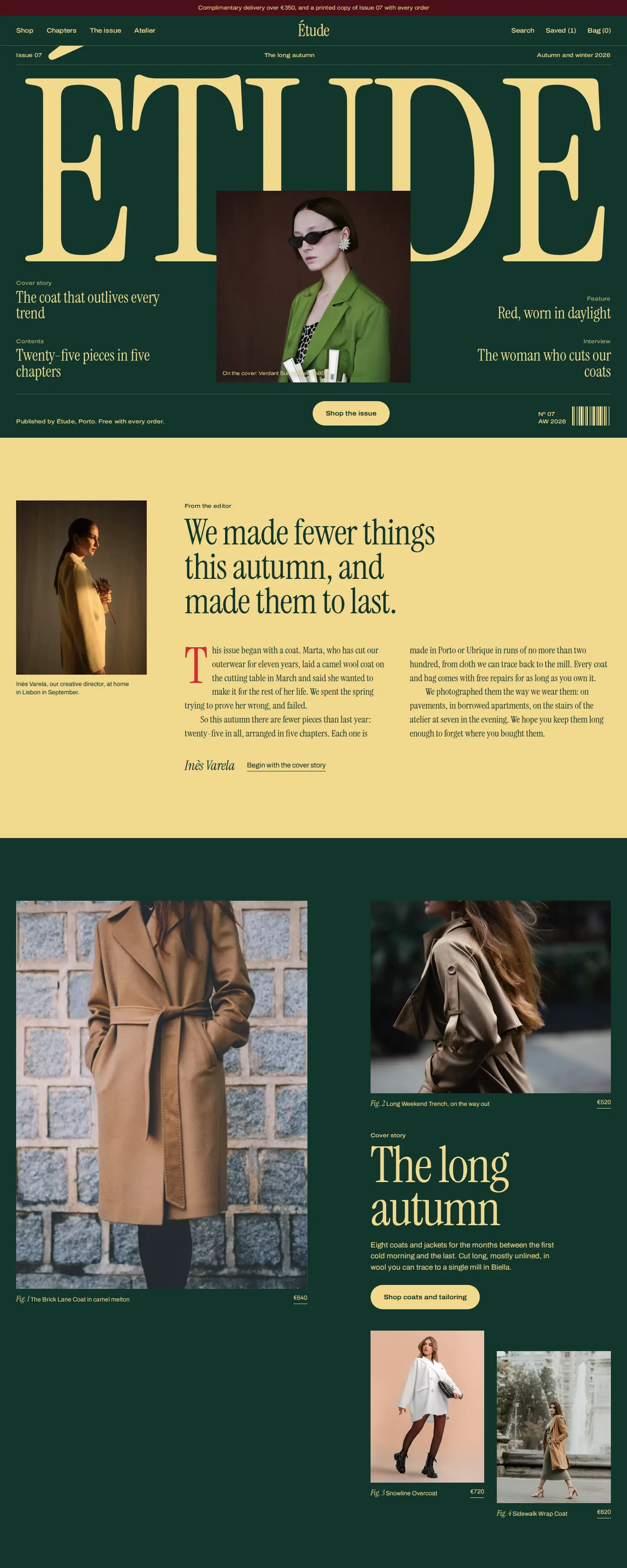
Étude — Editorial Atelier takes a magazine-like approach: cover story, lookbook, chapters, atelier narrative and shoppable products. Its design suggests that a brand can connect storytelling to the catalogue without abandoning commerce.
The useful principle is a clear link between an editorial feature and the garments shown within it. A viewer who enjoys the story should be able to identify and open an associated product. Conversely, the design still needs a direct collection route for shoppers who arrive with a specific purchase in mind.
The concept is a preview, not a claim about real-world sales performance or Shopify theme readiness. Production would require connected inventory, accurate size data, real product imagery and tested transactions.
Zazá: distinctive personality without losing product clarity
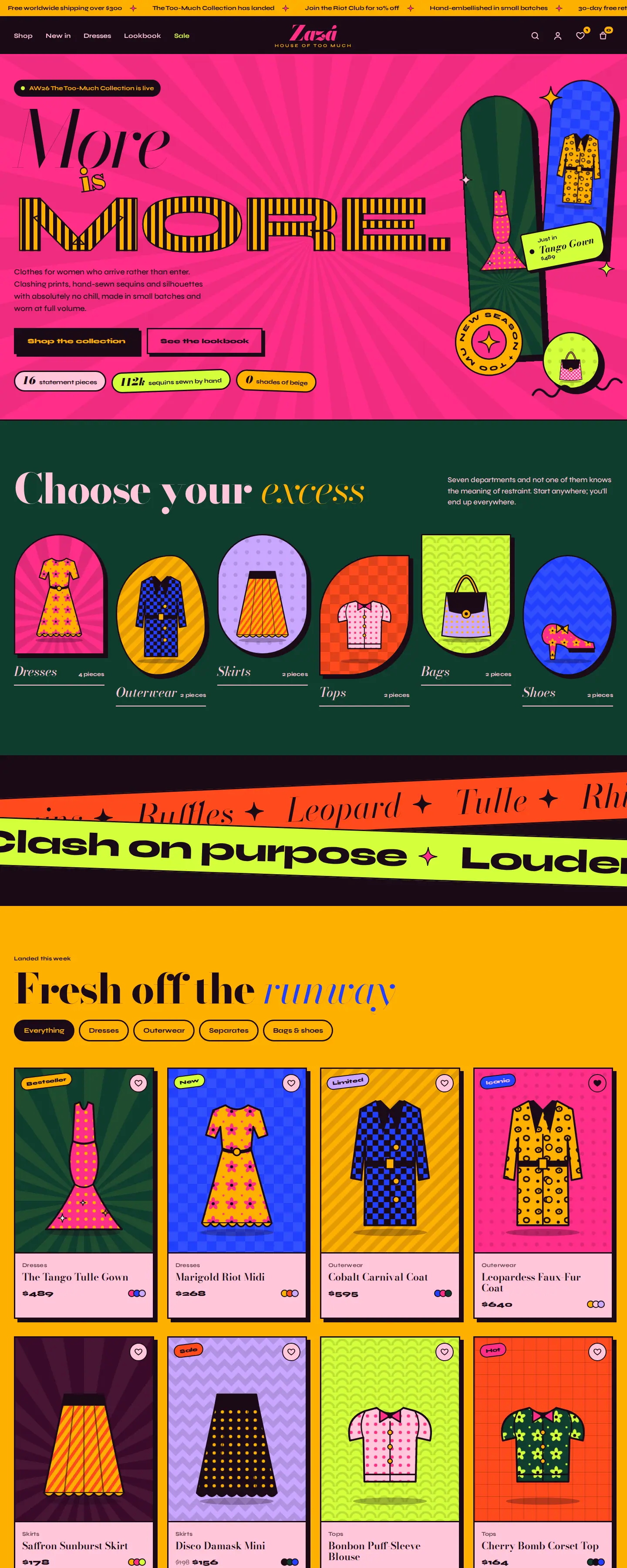
Zazá — House of Too Much deliberately moves away from understated luxury. Its headline “More is MORE” sets the tone, with sections such as “Choose your excess”, “Fresh off the runway” and “The Clash Edit”. The identity is memorable because it commits to a position.
The design lesson is that fashionable does not have to mean minimalist. But a maximalist storefront still needs legible product names, prices, size choices and an understandable cart. Expressive graphics should enhance the browsing journey instead of blocking the purchase decision.
Explore women's fashion Shopify designs or the broader fashion design collection to compare other visual directions.
8. Editorial content should connect back to products
Lookbooks, style guides, campaign pages and shoppable edits can help brands show how individual pieces work together. The strongest versions have a clear bridge between inspiration and the products that create the look.
For example, a “Three ways to wear wide-leg trousers” page can link each styling combination to the exact products used. A seasonal capsule page can group the relevant items and provide accessible sizing and availability. An occasionwear edit can explain why certain cuts or materials suit that occasion.
Do not generate endless superficial style articles without a relationship to merchandise. Fashion editorial content should either answer a real buyer question or give a meaningful route to items in the store.
9. Mobile fashion shopping needs its own hierarchy
Many fashion customers arrive through a product link shared on social media or through search. That means they may land directly on a product detail page rather than the homepage. The mobile PDP must stand on its own.
- Show the garment and its full silhouette quickly, with a useful image gallery.
- Keep the price, available sizes and selected colour close to the purchase action.
- Make the size guide visible without forcing the user to abandon the page.
- Keep returns, shipping and material details accessible.
- Ensure sticky purchase controls do not cover options or content.
- Test product filters and menu overlays with real category names.
- Make tap targets comfortable and states clear when a variant is unavailable.
A mobile design that looks beautiful in a static mockup may behave very differently with long product titles, six sizes, multiple colours or a low-stock message. Test with realistic data and real devices before launch.
10. Shopify design and Shopify implementation are different deliverables
Shopify supplies the ecommerce infrastructure, but a polished concept does not automatically become a functioning Shopify theme. A design may exist as a live HTML demonstration, a theme, a visual prototype or a custom coded storefront. The purchase terms and technology matter.
For a production Shopify store, confirm whether the work includes theme implementation, product and collection data, variants, inventory, navigation, payments, shipping profiles, tax settings, policies, apps, analytics and launch testing.
If the choice between Shopify and a custom ecommerce implementation is still open, see our Shopify vs custom ecommerce website guide. For a wider overview of navigation, product pages, carts and checkout, read our ecommerce website design blueprint. The current article focuses on fashion-specific decisions: fit, imagery, assortment, variant selection and brand editorial.
11. Keep technical SEO aligned with the real fashion catalogue
Search visibility depends in part on accurate product titles, descriptions and collection structure, not just attractive visuals. A helpful page should make the garment type, relevant attributes and meaningful variations clear.
Google's Product structured data guidance explains how product pages may be eligible for richer search presentation when the required real-world details, such as price and availability, are available. ProductGroup markup can describe related size and colour variants, but must match the site's canonical and variant architecture.
Don't publish dozens of interchangeable collection pages to chase every clothing keyword. Build navigable collections grounded in actual inventory, then support them with useful editorial pages where there is distinct customer intent.
12. What to measure after launch
Design quality should not be judged solely by first-week traffic. Track whether visitors actually find products, select variants and complete checkout. For a small or newly launched store, the data may be too thin to support confident conversion conclusions, so combine analytics with usability observation.
Useful questions include: Are product pages receiving visits but no add-to-cart actions? Are people repeatedly opening size information? Do shoppers encounter unavailable sizes? Are delivery charges introduced too late? Do customers navigate through editorial pages to the intended products?
These are diagnostics, not automatic explanations. A low conversion rate can also reflect product-market fit, price, assortment, traffic quality or fulfilment credibility. Changing the theme alone will not solve every commercial problem.
Fashion Shopify store pre-launch checklist
- Brand: Is the audience and style position immediately understandable?
- Categories: Can shoppers browse by clothing type and sensible needs?
- Filters: Are size, colour, fit, price and availability accurate?
- Photography: Do product galleries show complete garments and relevant details?
- Size guidance: Are real measurements and model-fit notes easy to find?
- Variants: Do size and colour selection update the correct product option?
- Product details: Are composition, care and fit accurately described?
- Trust: Are reviews and any brand or origin claims substantiated?
- Returns: Is the actual returns policy clear before payment?
- Mobile: Do galleries, menus, filters and add-to-cart work comfortably?
- Checkout: Do real test orders follow the expected payment and shipping flow?
- SEO: Are collection/product metadata and variant URLs coherent?
Frequently asked questions
What makes a good fashion Shopify store design?
A good fashion store combines a distinctive visual identity with clear category navigation, accurate product imagery, fit and size guidance, understandable variants, honest returns information and a usable mobile purchase journey.
Should a fashion store look minimalist or editorial?
Either can work. Choose the visual language that suits the product and customer. A restrained brand should not hide important information in pursuit of minimalism; a more expressive brand should not obscure basic shopping tasks. Étude and Zazá illustrate different aesthetic directions with the same need for commerce clarity.
What should I show on a clothing product page?
Show accurate garment photos, a useful size guide, relevant measurements, fit information, material and care details, price, variants, availability and shipping/returns access. The exact details depend on the garment type.
Can a design concept become a working Shopify store?
Potentially, but the technology and implementation work must be scoped. A static or HTML concept does not automatically include an installable Shopify theme, live inventory, payment integration or production support. Confirm the deliverables before purchasing or commissioning the build.
Does better Shopify store design guarantee more sales?
No. Better usability can remove obstacles in the shopping journey, but sales also depend on demand, product quality, pricing, traffic, shipping and trust. Test changes with real visitors instead of assuming that a redesign alone will raise conversions.
Choose the visual direction. Keep the shopping experience clear.
Explore premium fashion designs from Depiction Studio, view live previews and confirm the platform and build options that fit your business.
Explore fashion designs ↗