Law firm website design is not one problem. A personal injury practice, a family law firm, an immigration lawyer and a corporate boutique may all need credibility, clear services and an easy way to make contact, but the way a prospective client evaluates each firm can be completely different.
That is why the strongest legal websites are not built from a generic checklist of “professional colours, attorney photos and a contact form.” They are built around the decisions a visitor needs to make: does this firm handle my problem, can I trust the people behind it, and what happens if I contact them?
This guide looks at law firm website design as a complete client journey — from the first screen and practice-area architecture to attorney profiles, intake, mobile behaviour, search visibility, accessibility and redesign planning.
Start with the type of legal decision the client is making
Before choosing a layout, a law firm should identify how its clients normally arrive and what they need to know before they are comfortable taking the next step.
An urgent consumer-facing practice may need immediate reassurance, a prominent phone number and a short intake path. A business or transactional practice can usually give visitors more room to evaluate capabilities, sectors, representative experience and individual lawyers. A multi-office firm may need a stronger people search, location structure and deeper navigation.
The website should therefore reflect the firm's real client journey rather than copying the structure of a completely different practice.
For urgent, high-stress legal matters
Visitors often need fast orientation. The site should make the relevant practice area, service location and next step obvious without requiring several clicks. Contact options should work cleanly on a phone and explain what happens after submission.
For considered or high-value commercial matters
Prospects may spend more time comparing expertise, lawyers, industries, transaction experience and insights. The website can support a longer evaluation path, but the information hierarchy still needs to be clear.
For broad or multi-practice firms
Navigation becomes a larger design problem. Practice areas, lawyers, offices and industries need to be searchable and connected without turning the site into a directory that feels difficult to use.
1. The homepage should route people, not explain everything
A law firm homepage has limited time to establish relevance. It should not attempt to reproduce every practice page, attorney bio and firm history. Its job is to orient visitors and send them to the right next page.
A strong homepage normally makes the following clear:
- what kind of legal work the firm handles;
- who the firm typically represents;
- where the firm practises or which markets it serves;
- which lawyers, matters or credentials support the positioning; and
- how a prospective client can start a conversation.
For a specialist firm, this can be concise. For a broader practice, the homepage may need a practice-area index, office selector or audience-based routes. The design should reduce choice rather than present twenty equal links.
2. Give important practice areas their own useful pages
One of the most common structural weaknesses in law firm websites is a single “Services” page containing a long list of practice areas with very little explanation.
That approach makes it harder for a visitor to decide whether the firm is relevant to a specific matter. It also gives search engines and AI systems very little context about the firm's actual work.
Important practice pages should explain the matter in client language, the kinds of situations the firm handles, the lawyers involved, relevant related services and the next step. The page should be useful even if the visitor lands there directly from search rather than through the homepage.
Where a firm has overlapping services, create a logical parent-and-child structure instead of publishing many near-identical pages. For example, an employment practice may have a broader employment law hub with focused pages for executive agreements, workplace investigations and restrictive covenants if the firm genuinely handles those areas.
3. Attorney profiles should help someone choose a lawyer
Attorney bios are not administrative pages. They are often decision pages.
A visitor who has already decided that the firm handles the right practice area may next want to know who they would actually be speaking with. A useful attorney profile can include:
- current role and practice focus;
- the types of clients or matters the lawyer works with;
- jurisdictions or bar admissions where relevant;
- selected experience that can be published appropriately;
- education and professional background;
- insights, speaking or publications where useful; and
- a direct contact or consultation route.
The design should also make profiles easy to scan on mobile. Long lists of credentials can be grouped so that the core value proposition appears before a visitor reaches the bottom of the page.
4. Build the contact and intake flow as part of the design
Many law firm websites treat the contact form as an afterthought. In practice, the intake experience is part of the website experience.
The American Bar Association's 2026 guidance on law firm websites recommends testing how easily prospective clients can understand what the firm does, navigate the site on a phone, use forms or scheduling tools and understand what happens after they make contact. It also notes that poorly functioning technology can create friction rather than improve the client experience. See the ABA's website review guidance.
From a design perspective, this means the form should ask for only the information needed to route the first conversation. If a firm uses scheduling, chat or an intake platform, the experience should be tested from the prospective client's side rather than assumed to work because the integration is technically installed.
Useful microcopy also matters. A short note such as “Submitting this form does not create an attorney-client relationship” may be appropriate depending on jurisdiction and firm policy, while confirmation messaging should explain what the visitor can expect next.
5. Trust signals need context, not decoration
Law firm websites often display awards, testimonials, case outcomes, years of experience, bar memberships and media mentions. These can be useful, but they should not become a wall of badges that replaces substantive information.
Trust is stronger when the evidence is connected to the visitor's decision. An attorney profile can show relevant experience. A practice page can explain the types of matters handled. A representative-matters section can provide context where publication is permitted. Client reviews may help some practices, but the way they are presented must comply with applicable rules.
Lawyer advertising rules vary by jurisdiction. The ABA specifically points firms toward rules concerning communications about legal services, prospective clients and confidentiality, and recommends careful review of statements about experience, fees, results, testimonials, awards and specialisation. The website should therefore avoid unsupported superlatives and claims that the firm cannot substantiate.
6. Location pages should serve real users, not become thin SEO copies
For firms with multiple offices or meaningful geographic service areas, location pages can be useful. They can explain the lawyers based in that office, relevant practice areas, contact details, directions and local context.
What does not help is publishing dozens of near-identical city pages with the location name swapped into the same paragraph. That creates a weak user experience and makes the website harder to maintain.
If geography matters, create pages only where there is enough genuine local value. A location page should function as a real destination, not as a doorway to another generic page.
7. Design the content system for search and AI discovery
A modern law firm website is more than a set of landing pages. Search engines, AI assistants, directories, referrals and social profiles can all send visitors directly into different parts of the site.
This makes content architecture important. The firm should have a clear relationship between:
- practice-area pages;
- attorney profiles;
- industry or client-type pages where relevant;
- location pages where genuinely useful;
- insights and articles; and
- contact or intake pages.
Internal links should reflect those relationships. An article about shareholder disputes can link to the relevant disputes practice and lawyer. The practice page can link to selected useful insights. A lawyer profile can show relevant practice areas and recent writing.
The result is a website that is easier for people to explore and easier for search systems to understand.
8. Mobile design needs its own decisions
A responsive website is not automatically a good mobile website. Shrinking a desktop layout can leave oversized menus, difficult forms, tiny links and decorative effects that get in the way.
For law firms, mobile priorities often include:
- clear practice-area navigation;
- easy access to phone or consultation actions;
- short forms with appropriately sized fields;
- readable attorney bios and service pages;
- fast-loading images and restrained animation; and
- contact information that does not require hunting through a footer.
Mobile should be tested with the actual content, not only with placeholder text. A navigation system that looks elegant with four sample links can fail when the real firm has twelve practice areas and six offices.
9. Accessibility should be part of the component system
Accessibility works best when it is built into the design system rather than added at the end.
That includes sufficient contrast, meaningful heading hierarchy, keyboard-accessible navigation, visible focus states, clear form labels, useful alternative text and controls that do not rely solely on hover. The W3C's Web Content Accessibility Guidelines provide a recognised framework for making web content more accessible.
For a law firm, accessibility also improves the general quality of the interface. Clear labels, readable text and predictable navigation make the site easier for everyone to use.
10. A redesign must protect what already works
A visually stronger website can still be a bad redesign if it destroys established search visibility, removes useful content or breaks incoming links.
Before replacing an existing site, create an inventory of important URLs, practice pages, attorney pages, locations, articles and external links. Decide which URLs can remain unchanged and which require permanent redirects.
Google's site-migration guidance recommends mapping old URLs to their new destinations, using permanent server-side redirects for moved pages, updating internal links and sitemaps, and monitoring the transition in Search Console. Google documents the migration process here.
For law firms, this is especially important because an older website may have years of links to attorney bios, practice pages and articles. A redesign should improve the experience without casually discarding that accumulated authority.
Two Depiction Studio law firm design directions
Depiction Studio currently has two live law-firm concepts. Both are built around boutique business law, but they show two different ways a legal website can organise authority and client navigation.
Harlow & Vance: editorial, structured and sector-led
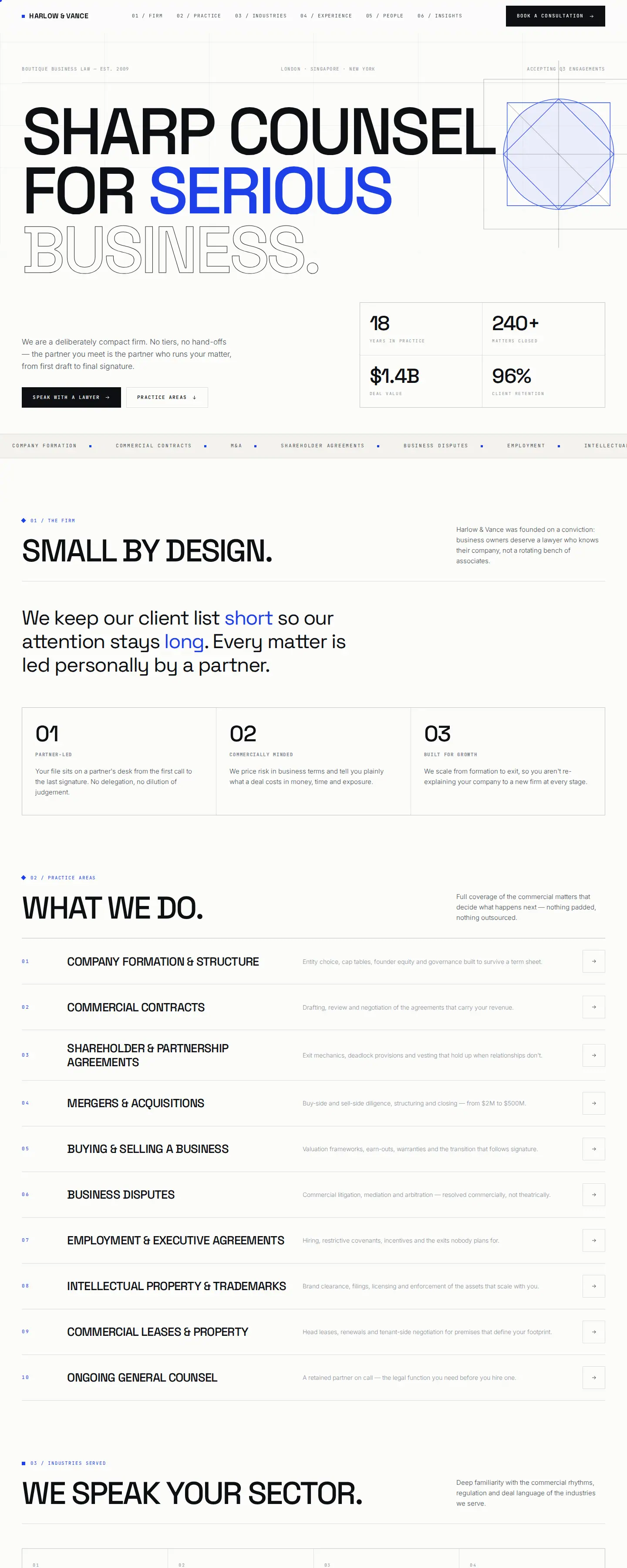
Harlow & Vance uses a restrained editorial system with clear sections for Firm, Practice, Industries, Experience, People and Insights. The homepage does not rely on conventional legal stock imagery. Instead, hierarchy comes from a disciplined grid, strong typography and a cobalt accent.
The practice index is designed to make a broad set of services scannable, while the industries layer helps business clients understand where the firm has relevant commercial context. This structure is particularly useful for a boutique practice that wants to look substantial without imitating a large institutional firm.

Aldine & Rook: practical service routing with a clear process
Aldine & Rook takes a more architectural approach. Its service navigation is central, and the concept includes a separate “How it works” sequence covering the first call, scope, the work and aftercare.
That process content is important because legal websites often explain what lawyers do but not what the client should expect after making contact. Making the engagement journey visible can reduce uncertainty before the consultation.
You can compare both concepts in the Depiction Studio law website designs collection or browse the wider Depiction Studio design library.
How this differs for a boutique business law firm
A specialist business-law practice can usually use a tighter architecture than a broad consumer-facing firm. Industries, transactions, commercial services and ongoing counsel may matter more than geographic pages or high-volume intake.
We have a separate guide on business law firm website design that goes deeper into boutique positioning, industry context, attorney credibility and the specific structure of a commercial legal practice. This article stays broader: it covers the website system a law firm needs regardless of practice mix.
WordPress, React or another platform?
There is no universal best platform for a law firm website. The right choice depends on how often the site changes, who manages content, how complex the attorney and practice directories are, what integrations are required and how much control the firm needs over performance and design.
WordPress can suit content-heavy firms that need straightforward editorial control and a familiar publishing workflow. A custom React or modern framework build can suit firms that need a more tailored interface, stronger application-like behaviour or a tightly controlled frontend. The platform should follow the operating requirements, not the other way around.
Whatever the stack, the firm should understand who owns the code and content, how updates are handled, how forms and analytics are configured, and what happens if the relationship with the original developer ends.
Law firm website design cost: what changes the scope?
There is no useful universal price for law firm website design because the scope can vary dramatically.
A smaller firm adapting a strong pre-designed direction is a different project from a multi-office practice rebuilding hundreds of pages, migrating years of articles, restructuring attorney profiles and integrating an intake platform.
The main cost drivers typically include:
- number and complexity of page types;
- custom design versus adapting an existing design;
- copywriting and content migration;
- attorney, practice, office and industry directory requirements;
- forms, scheduling, CRM or intake integrations;
- SEO migration and redirect work;
- accessibility and performance requirements; and
- ongoing support after launch.
When comparing proposals, ask what is actually included rather than comparing only the headline price.
Pre-launch checklist for a law firm website
- Positioning: Can a new visitor tell what the firm does and who it helps?
- Practice pages: Do the important services have enough depth to stand on their own?
- People: Are attorney profiles current, useful and easy to reach?
- Contact: Does every major path lead naturally to a working intake option?
- Mobile: Are navigation, forms and calls to action easy to use on a phone?
- Accessibility: Are contrast, keyboard use, labels, headings and focus states considered?
- Ethics review: Have claims, testimonials, results, specialisation language and disclaimers been reviewed for the applicable jurisdiction?
- SEO: Are titles, descriptions, canonicals, internal links and redirects correct?
- Migration: Have old URLs been mapped and redirected where necessary?
- Ownership: Does the firm know who controls the domain, hosting, code, analytics and content?
Law firm website design FAQ
What should a law firm website include?
Most firms need a clear homepage, detailed practice-area pages, attorney profiles, contact or intake pages, firm information and the legal or privacy notices appropriate to the jurisdiction. Multi-office or sector-focused firms may also need location and industry pages.
What makes a law firm website trustworthy?
Clarity is the foundation. Visitors should be able to verify what the firm does, who the lawyers are, where they practise and how to contact them. Relevant experience, publications, reviews or representative matters can add credibility where they are appropriate and compliant.
Should a law firm use a template or custom design?
A strong pre-designed website can be an efficient starting point when its structure already fits the firm. Custom design is more useful when the firm's content model, brand, integrations or user journeys are sufficiently unusual that adapting an existing direction would create compromises.
How often should a law firm redesign its website?
There is no fixed schedule. Redesign when the site no longer reflects the firm, is difficult to use or update, performs poorly on mobile, cannot support current content or technology needs, or creates measurable friction in the client journey. Do not redesign simply because a certain number of years has passed.
Start with a law-firm design you can inspect before committing.
View Depiction Studio's law website designs live, compare the navigation and visual approach, then own a design or have it customised and built for your firm.
Explore law website designs ↗