
A business law firm website has a narrow job: help the right company decide, quickly, that your firm understands the commercial problem in front of them and is worth speaking to. That is different from simply looking “professional.” A polished site can still underperform if the positioning is vague, the practice areas are hard to scan, the lawyers are buried, or the route to a consultation is unclear.
For a boutique practice, the strongest website design usually feels selective rather than oversized. It should show what the firm does, who it does it for, how its lawyers think, and what a prospective client should do next. The visual system should reinforce authority without falling back on the usual legal clichés.
What a business law firm website needs to accomplish
A prospective client may arrive after a referral, a search for a specific service, or a recommendation from another adviser. Whatever the route, the website should answer three questions within a few minutes:
- Is this firm relevant to my matter? The practice areas and client types should be obvious.
- Do I trust the people behind it? Attorney profiles, experience, insights and tone all matter.
- What is the next step? The contact or consultation path should be simple on desktop and mobile.
That is the practical framework for business law firm website design. Every page, navigation label and visual decision should support one of those three jobs.
1. State the firm's position before the visitor has to interpret it
“Full-service legal solutions” tells a business owner almost nothing. A boutique firm should be more specific. The opening screen can establish the kind of work the firm handles, the kinds of businesses it advises, or the commercial moment it is built around.
For example, a firm focused on founders and growing companies might lead with company formation, contracts, shareholder arrangements, transactions and ongoing counsel. A practice with a stronger M&A focus could foreground acquisitions, exits and deal support. The point is not to list everything in the hero. It is to make the firm's centre of gravity understandable.
Good hero copy is usually paired with one primary action such as Book a consultation, Speak with a lawyer or Tell us about the matter. Avoid forcing visitors to choose between five equally prominent buttons.
2. Build the service architecture around real business decisions
Practice-area navigation is one of the most important parts of a business law website. A visitor should not have to understand internal legal terminology before finding the right service.
A useful structure might include:
- company formation and structuring;
- commercial contracts;
- shareholder and partnership agreements;
- buying or selling a business;
- mergers and acquisitions;
- employment and executive agreements;
- intellectual property and trademarks;
- business disputes; and
- ongoing or outside general counsel.
Each important service should have enough space to explain the problem, the type of client it suits, the usual scope of work and the next step. A single page with ten one-line practice areas may look clean, but it gives both people and search engines very little context.
3. Show commercial context, not only legal capability
Business clients often want to know whether a lawyer understands their operating environment. An industry layer can make the site far more useful, especially for a boutique firm with clear sector strengths.
Technology and SaaS, financial services, real estate and hospitality, healthcare, manufacturing, creative businesses and professional services all raise different commercial questions. A dedicated industries section lets the firm explain that context without duplicating every practice page.
The key is specificity. Do not create eight thin industry pages that repeat the same paragraph with a different sector name. If an industry page exists, it should contain genuinely relevant services, issues, terminology and insight.
4. Treat attorney profiles as decision pages
For many law firms, the attorney bio is one of the highest-intent pages on the site. Someone considering a consultation may want to know who they would actually work with.
A strong profile normally includes the lawyer's role, practice focus, relevant sector experience, professional background, selected representative experience where appropriate, and a direct way to make contact. The writing should sound like a person, not a directory entry.
Photography also matters. Consistent, well-directed portraits can make a boutique practice feel cohesive. If the firm prefers a more editorial or minimal approach, the design can still create a strong people section through typography, initials, restrained portraits or graphic treatments. What matters is that the people do not feel hidden.
5. Use experience and insights to demonstrate depth carefully
Authority does not need to come from oversized claims. A recent-matters section, representative experience, articles, brief legal updates or practical guides can show how the firm thinks.
This content should be handled carefully. Rules around attorney advertising, testimonials, specialisation claims and descriptions of results vary by jurisdiction. Firms should review the requirements that apply to them before publishing claims or past-matter language. The American Bar Association's Business Law Today overview on law-firm website design is a useful general starting point, but it is not a substitute for jurisdiction-specific review.
From a design perspective, experience is usually more credible when it is structured and restrained. A concise matter type, sector and role can be easier to scan than a large block of promotional copy.
6. Make the design feel authoritative without looking generic
Legal websites often default to dark navy, courthouse photography, gavels and stock images of handshakes. None of those elements is inherently wrong, but they can make very different firms look interchangeable.
A premium boutique law firm website can create authority through typography, spacing, hierarchy and contrast instead. A disciplined grid, a distinctive type pairing, a limited colour system and strong editorial pacing can feel more credible than decorative effects.
The visual identity should also match the firm's commercial position. A corporate transaction practice may benefit from a precise, structured system. A founder-focused firm might feel more direct and contemporary. A private-client practice would need a different tone again. “Premium” is not one visual style; it is coherence between audience, message and execution.
Two Depiction Studio law-firm design approaches
Aldine & Rook: structured, practical business law
Aldine & Rook is a Depiction Studio concept built specifically for business law. Its navigation separates Services, Industries, Matters, Team and Insights, with a direct “Speak with a lawyer” consultation route.
The design uses an architectural, blueprint-like visual language rather than conventional legal imagery. That gives the site a sense of structure while allowing service information to remain central. The concept also gives “How it works” its own section, which is useful for a boutique firm that wants to reduce uncertainty around the first call and engagement process.
The lesson is not that every law firm needs this exact visual motif. It is that the design language can express the firm's way of working while the information architecture stays practical.
Harlow & Vance: editorial authority and sector fluency
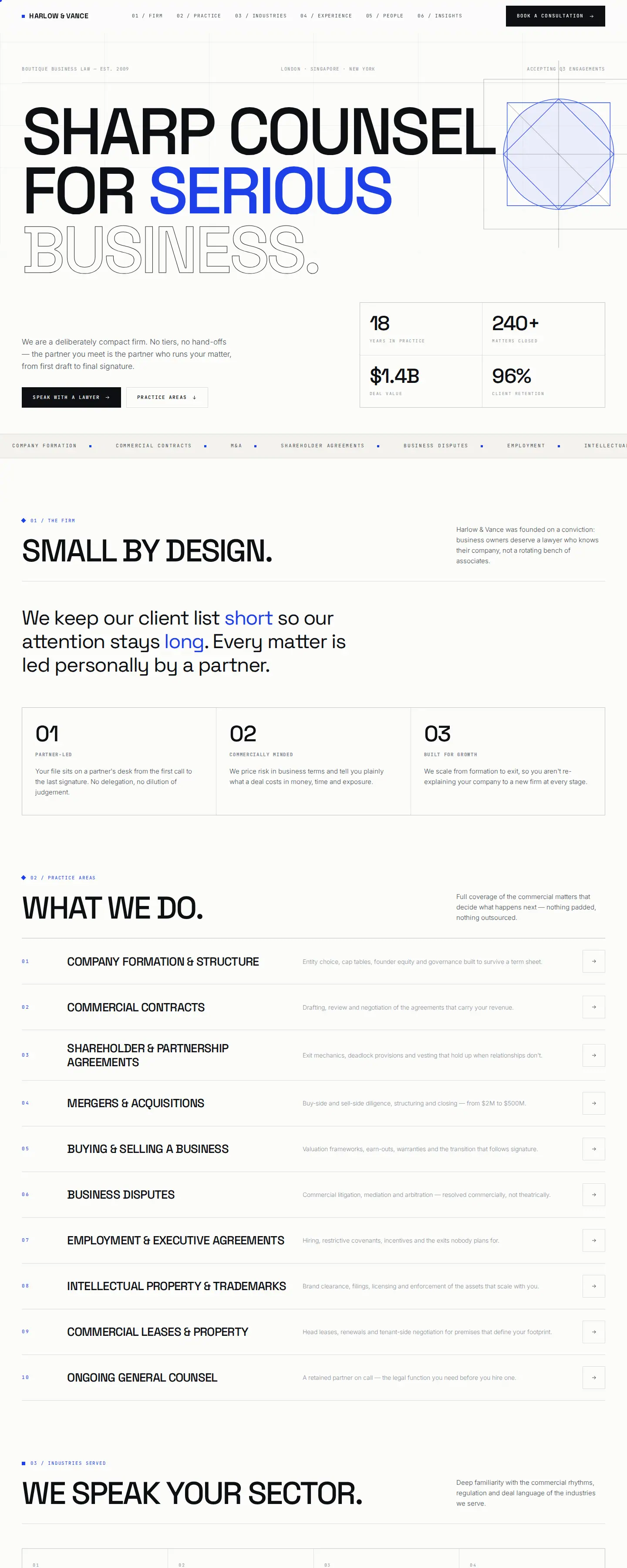
Harlow & Vance takes a different approach. The homepage is organised around Firm, Practice, Industries, Experience, People and Insights. The industries section is especially prominent, which suits a boutique practice positioning itself around commercial understanding rather than sheer practice breadth.
Its off-white, black and cobalt palette is deliberately restrained, while the typography and grid create most of the character. This is a useful pattern for firms that want a modern website without sacrificing seriousness.
Both concepts can be viewed from the Depiction Studio law website designs collection. They are different visual answers to the same business problem: making a specialist law practice easy to understand and easy to contact.
Pages a boutique business law firm should consider
- Home. Positioning, primary services, credibility, selected people or experience, and a clear consultation path.
- Practice areas. A useful overview plus dedicated pages for commercially important services.
- Industries. Only where the firm has genuine sector focus and enough substance to say something specific.
- People. Attorney profiles that explain focus, experience and fit.
- Experience or matters. Representative work where publication is appropriate and compliant.
- Insights. Articles that answer real client questions rather than publishing for volume alone.
- About the firm. What makes the practice different, how it works and what clients can expect.
- Contact or consultation. A short route to the right person, with clear location and contact information.
- Privacy and required legal notices. Based on the firm's jurisdiction, technology and data collection.
Not every firm needs a large site. A focused eight-page website with clear service depth can be stronger than a 40-page site filled with duplicated copy.
Mobile UX matters more than a smaller version of desktop
A referral may open the firm's website from an email or message on a phone, then make a decision in minutes. Mobile design therefore needs its own priorities.
- Keep the primary navigation short and understandable.
- Make the consultation action easy to reach without covering the content.
- Use readable type sizes and comfortable line lengths.
- Keep forms short; ask only for information needed to start the conversation.
- Avoid heavy animations that delay access to services or contact information.
- Maintain strong colour contrast and visible keyboard focus states.
- Compress large images and keep the page responsive on slower connections.
The best mobile experience is not the one with the most effects. It is the one that lets a prospective client understand the firm, verify fit and contact it with minimal friction.
Template, pre-designed website or fully custom build?
A boutique business law firm does not always need to begin from a blank canvas. If a pre-designed website already has the right information hierarchy, visual tone and mobile behaviour, it can be an efficient starting point.
The important question is how much needs to change. Branding, typography, copy, attorney profiles, service pages, contact flows and jurisdiction-specific content all need to reflect the actual firm. A template that is merely recoloured and filled with generic text will still feel generic.
Starting from a strong design is most useful when the structure is already close to the firm's needs. Fully custom design makes more sense when the positioning, content model or functionality is unusual enough that adapting an existing direction would create compromises.
Depiction Studio's model is built around that choice: you can view the law-firm designs live first, then own the design or have it customised and built for your firm.
Common law firm website design mistakes
- Generic positioning. The site could belong to any firm in any city.
- Practice areas without depth. Visitors see labels but cannot understand what the firm actually does.
- Lawyers hidden behind the brand. The people a client may hire are difficult to find.
- Impressive but vague copy. Words such as “strategic,” “innovative” and “trusted” replace useful information.
- Too many calls to action. Every section asks for a different next step.
- Unverified or poorly framed claims. Marketing language creates unnecessary credibility or compliance risk.
- Desktop-first interaction. Navigation, forms or effects become awkward on a phone.
Business law firm website design FAQ
What should a business law firm website include?
At minimum, it should make the firm's positioning, practice areas, attorneys and contact path clear. Most boutique firms also benefit from industry context, representative experience where appropriate, insights and a concise explanation of how the engagement process works.
Should a boutique law firm use a website template?
It can, provided the starting design already fits the firm's information architecture and quality expectations. The site should still be customised around the firm's brand, lawyers, services, content and consultation process. A pre-designed direction is a starting point, not a substitute for firm-specific content.
What makes a law firm website look premium?
Consistency matters more than decoration. Strong typography, controlled spacing, a limited colour system, clear hierarchy, high-quality imagery or graphic treatment, and disciplined copy usually create a more premium impression than adding more visual effects.
How should a law firm website generate enquiries?
Make the next step obvious. Use one primary consultation action, support it with clear service and attorney information, and keep the contact form proportionate to the first conversation. The website should help a potential client decide that the firm is relevant before asking them to submit details.
See business law website directions before choosing one.
View Depiction Studio's law-firm designs live, compare the structure and visual approach, then own a design or have it customised and built for your practice.
Explore law website designs ↗