Dental website design has a harder job than simply making a practice look modern. A prospective patient may arrive while comparing local dentists, researching a treatment, worrying about cost, or trying to book because something hurts. The website has to create confidence without overwhelming them.
That makes a dental practice website part brand experience, part patient information system and part appointment pathway. The best structure is not the one with the most animation or the longest list of treatments. It is the one that helps a patient answer a few practical questions quickly: Can this practice help me? Who will I see? What will the visit feel like? What might it cost? How do I book?
This guide looks at those decisions from a design and build perspective, with examples from Depiction Studio's current dental concepts.
What high-converting dental website design gets right
“High-converting” does not mean aggressive. A dental website usually converts by reducing uncertainty.
A new visitor should be able to understand the practice, find the right treatment, see the people behind the clinic and reach a booking or contact option without friction. The American Dental Association's website-content guidance makes a similar point: a practice website should appeal to prospective and current patients, communicate the practice's mission and brand, and include information patients actually want to know. See the ADA's website design and content guidance.
That gives dental website design a useful priority order:
- Make the practice easy to understand.
- Make treatment information easy to navigate.
- Make the dentists and team visible.
- Make booking or contact obvious.
- Reduce anxiety around the visit, fees and what happens next.
1. The homepage should answer the patient's first questions
A dental homepage does not need to explain every procedure. It needs to orient the visitor.
The first screen should establish the practice type, location and primary action. A general family practice may focus on routine care, emergencies and a welcoming tone. A cosmetic clinic may give more prominence to results, smile design and consultations. An implant or specialist practice may need more explanation of expertise, technology and treatment planning.
Whatever the positioning, the homepage should make the next step obvious. “Book an appointment,” “Request a consultation” or “Call for emergency care” are clearer than a collection of equally prominent buttons.
It is also worth showing practical information earlier than many practices do. Location, opening hours, accepted payment or financing approaches, and whether new patients are welcome can remove uncertainty before the visitor reaches the contact page.
2. Organise treatments around patient needs, not internal terminology
Treatment architecture is one of the most important parts of a dental website.
A patient may know they need a check-up, whitening or an emergency appointment. They may not know the technical name of the treatment they need. Good navigation therefore combines clear treatment names with enough explanation to help someone self-orient without turning the website into medical advice.
A useful general structure might include:
- check-ups and preventive care;
- emergency dentistry;
- restorative treatments;
- cosmetic dentistry;
- orthodontics or aligners where offered;
- implants or tooth replacement where offered;
- children's dentistry where relevant; and
- gum care or other specialist services where relevant.
The exact structure should follow the practice. Do not publish a treatment page simply because competitors have one.
Each important treatment page should explain what the service is, who it may be relevant to, what the patient can expect at a high level, who provides it, and how to take the next step. Clinical claims and treatment information should be reviewed by the practice before publication.
3. Dentist profiles should feel like trust pages
For many patients, choosing a dentist is personal. The website should not hide the clinicians behind a generic brand.
A useful dentist profile can include:
- professional name and role;
- areas of clinical focus;
- education, registrations or relevant professional background;
- languages spoken where useful;
- a concise personal introduction; and
- a direct path to book or contact the practice.
Photography matters here. Consistent portraits and real practice imagery can make the site feel more credible than generic stock photography. The ADA also recommends including concise biographies of dentists and staff as part of effective practice website content.
Do not turn the profile into an unreadable wall of credentials. The first section should help a patient understand the person; detailed qualifications can follow.
4. The booking flow should be designed, not simply embedded
Installing an online booking widget does not automatically create a good booking experience.
The website needs to answer practical questions around the booking action. Is the booking for a new or existing patient? Can someone choose a dentist? Are emergency appointments handled differently? What happens after the request is submitted?
On mobile, the booking path should be especially simple. Buttons need comfortable touch targets, forms should not ask for unnecessary information, and the patient should not have to close several overlays before reaching the scheduler.
If the practice only accepts appointment requests rather than confirmed online bookings, say so. Clear expectations reduce frustration.
5. Fees, insurance and financing need careful presentation
Cost is one of the biggest sources of uncertainty in healthcare purchasing, but dental websites often make it difficult to find even basic information.
That does not mean every practice needs to publish a complete fee schedule. The right level of transparency depends on the practice, treatment complexity and local requirements. But the site can still explain how fees are discussed, which payment methods are accepted, whether financing or membership options exist, and how dental benefits are handled.
The ADA notes that dental-benefit information can be complicated and that practices should be careful about trying to explain every plan online. A clear overview with a route to confirm details may be more useful than an exhaustive list.
From a design perspective, the goal is to remove the feeling that financial information is hidden.
6. Reviews and patient stories need privacy-aware handling
Reviews can help prospective patients evaluate a practice, but healthcare reviews require more care than ordinary ecommerce testimonials.
The ADA's guidance on online reviews warns that patient privacy obligations can apply when a dental practice responds publicly. Even if a reviewer discloses treatment details, the practice should not casually confirm or add identifiable information in a response. Review the ADA's current guidance on managing online reviews.
On the website itself, use testimonials, before-and-after images and patient stories only when the practice has the appropriate permissions and can publish them lawfully and ethically. Do not invent or anonymise patient stories in a way that makes them look real if they are not.
7. Visual design should reduce clinical anxiety
Dental websites tend to fall into two extremes: overly clinical blue-and-white templates or highly stylised sites that sacrifice clarity.
A stronger approach is to match the visual tone to the practice while keeping patient information easy to use.
Soft colour systems and generous spacing can suit a calm premium practice. A darker architectural system can suit a technology-forward clinic. A family practice can use a more energetic identity while still keeping treatment, fees and booking clear.
The important point is that visual personality should support the patient experience. If the practice wants nervous patients to feel at ease, the website should not begin with intimidating treatment imagery or dense technical copy.
Three Depiction Studio dental design approaches
Depiction Studio currently has three dental concepts in the Dental Website Designs collection. They use different visual systems, but all are structured around patient questions rather than generic corporate sections.
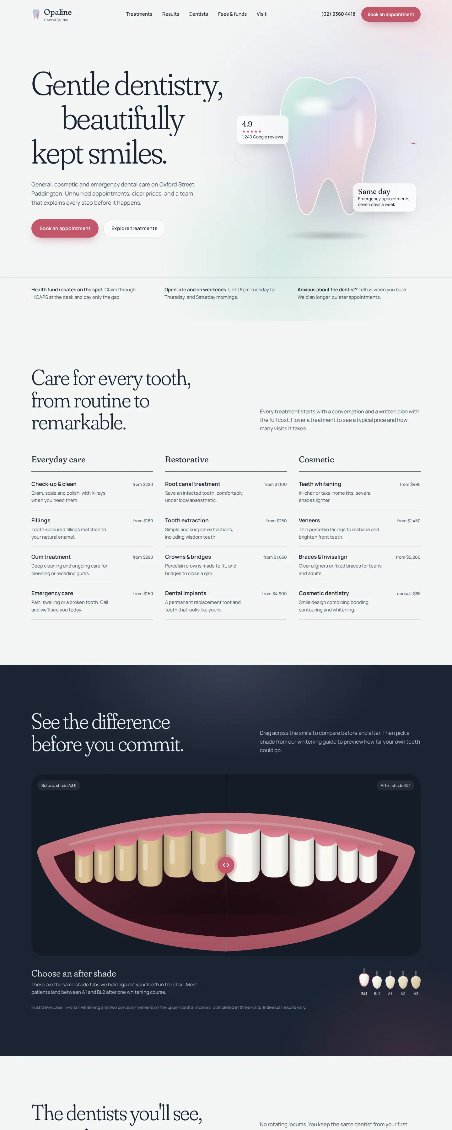
Opaline Dental Studio: calm premium dentistry
Opaline Dental Studio is the quietest of the three. Its structure moves from treatments into results, dentist profiles, fees and funds, location, and booking.
The treatment information is grouped into everyday, restorative and cosmetic care rather than presented as one enormous list. The design also gives the dentists a prominent role and includes fee guidance before the final booking section.
This approach suits a practice that wants to feel considered and premium without becoming cold.
Arcline Dental: precision and process
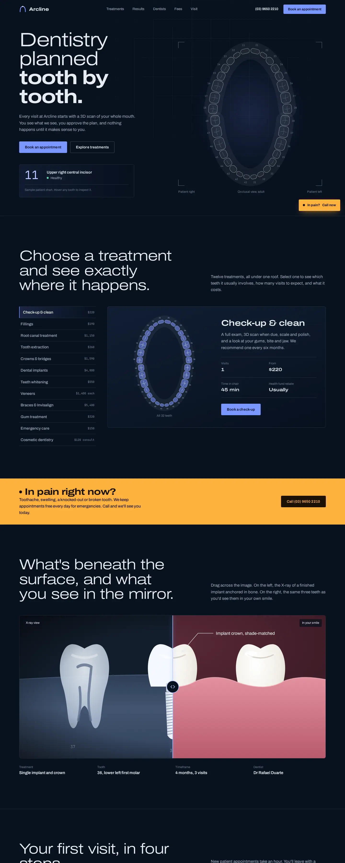
Arcline Dental uses a darker, more technical visual language. The homepage makes the process visible through a four-step first-visit sequence: Scan, See, Plan, Treat.
That is a useful design pattern for practices using technology as part of their positioning. Rather than merely saying the clinic is “advanced,” the interface explains how the patient journey works.
The site also gives fees, health-fund claims, dentist profiles and location their own clear moments. That reduces the amount of practical information hidden behind a generic contact page.
Grin Dental Co.: friendly family dentistry
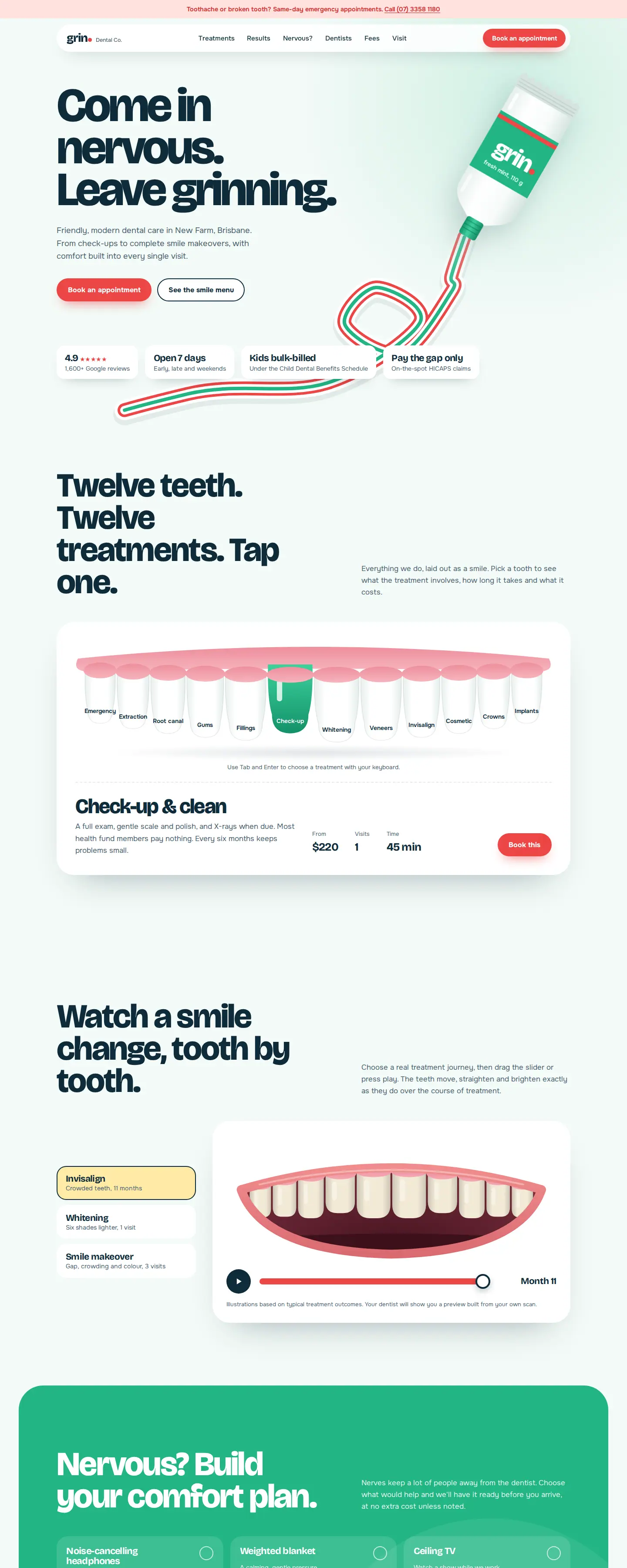
Grin Dental Co. takes the most informal approach. The headline — “Come in nervous. Leave grinning.” — immediately positions the practice around comfort.
The site includes a dedicated “Nervous?” section, dentist profiles, pricing information, health-fund guidance, a kids offering and pay-over-time information. The design has more character, but the key patient tasks remain visible.
This is a good example of how dental website design can feel distinctive without losing practical structure.
8. Mobile dental website design has different priorities
Many prospective patients will first encounter the practice on a phone, especially through local search, maps, social links or a recommendation sent by message.
Mobile design should therefore prioritise:
- a short, understandable navigation;
- easy access to phone and booking actions;
- readable treatment pages;
- dentist profiles that do not require excessive scrolling;
- forms with properly labelled fields;
- maps and contact details that are easy to use; and
- fast-loading images and restrained animation.
A desktop site with large visual effects can look impressive in a presentation but become frustrating on a phone. Test the real booking journey at common mobile widths before launch.
9. Accessibility should be part of the design system
Accessibility is not just a final checklist. It affects typography, contrast, keyboard navigation, forms, focus states, image descriptions and touch-target sizing.
The W3C recommends the current Web Content Accessibility Guidelines (WCAG) 2.2 as a shared standard for making web content more accessible.
For a dental practice, following accessible design principles also tends to improve general usability. Clear labels, readable contrast and predictable navigation help older patients, people using assistive technologies, and anyone trying to book quickly from a phone.
Specific legal obligations vary by jurisdiction, so a practice should obtain appropriate advice rather than treating a design checklist as legal compliance.
10. Local information should be easy to verify
A dental practice website is closely tied to location. The site should make the practice name, address, phone, hours and map information easy to find and consistent with other major business listings.
If the practice has multiple locations, each location should have genuinely useful information rather than a near-duplicate page. Show the dentists who work there, relevant services, opening hours, parking or transport details where useful, and the correct booking path.
The ADA's guidance on attracting new patients specifically recommends a professional website with detailed practice information, team biographies, services, financing information and a map to the office. See the ADA's practice-marketing guidance.
11. The website should be useful to existing patients too
A dental website is not only a lead-generation page.
Existing patients may need opening hours, contact details, directions, patient forms, post-visit information, payment guidance or a way to reschedule. If those routine tasks are hard to find, the website creates more work for the front desk.
Design the information architecture for both audiences: prospective patients deciding whether to book and existing patients trying to complete a task.
Template, pre-designed website or custom dental website?
A dental practice does not always need to start from a blank canvas.
A strong pre-designed dental website can be an efficient starting point when the layout already reflects the way patients browse: treatments, team, fees, location and booking. It should still be customised with the real practice brand, dentists, photography, treatment information, fees, policies and integrations.
Fully custom design becomes more valuable when the practice has a distinctive positioning, multiple locations, complex treatment pathways, unusual integrations or a content model that cannot be handled cleanly by an existing direction.
Depiction Studio lets practices view dental website designs live first, then own the design or have it customised and built around the actual practice.
What pages should a dental practice website include?
There is no fixed page count, but most practices should consider:
- Home: positioning, priority treatments, trust, location and booking.
- Treatments: an overview plus detailed pages for important services.
- Dentists / Team: profiles, roles and relevant professional background.
- New Patients: what to expect, forms, practical information and first-visit guidance.
- Fees / Insurance / Financing: whatever level of information the practice can present accurately.
- Results: only where before-and-after content is appropriate and properly authorised.
- About / Practice: philosophy, facilities and relevant technology.
- Contact / Location: address, hours, map, phone and booking route.
- Privacy and required notices: appropriate to the jurisdiction and technology used.
A specialist clinic may need fewer broad pages but deeper treatment information. A larger family practice may need stronger navigation across age groups or service categories.
Dental website design mistakes to avoid
- Generic clinic branding. The site looks interchangeable with every other dentist in the area.
- Too much clinical jargon. Patients cannot work out which treatment is relevant.
- Hidden booking. The primary action changes from page to page or is difficult to use on mobile.
- No visible people. Dentist profiles are missing or buried.
- Stock-only imagery. Visitors never see the real team or environment.
- Fees are treated as taboo. There is no explanation of how costs, benefits or financing are handled.
- Reviews are used carelessly. Patient privacy and permission are not considered.
- Accessibility is added at the end. Contrast, forms and keyboard behaviour are difficult to retrofit.
- The site serves only new patients. Existing patients cannot quickly find routine information.
Dental website design FAQ
What should a dental website include?
At minimum, it should clearly present the practice, treatments, dentists, location, contact details and appointment pathway. Most practices also benefit from new-patient information, fee or insurance guidance, patient resources and carefully handled reviews or results.
What makes a dental website feel trustworthy?
Real dentist profiles, authentic practice photography, clear treatment information, visible contact details, practical fee guidance and a predictable booking process all help. The design should make the practice easy to understand rather than relying on generic claims such as “best” or “leading.”
Should a dental practice use online booking?
If the practice's scheduling workflow supports it, online booking can reduce friction. The important part is making the experience clear: which appointments can be booked, whether the booking is confirmed or requested, and what the patient should expect next.
Should dental websites show prices?
That depends on the practice, treatment and jurisdiction. Some practices publish starting prices or common fees; others explain how quotes, insurance or financing work. Whatever approach is used should be accurate and easy to understand.
Can a dental website start from a template?
Yes, if the starting design already has the right patient journey and can be properly customised. The final site should use the real practice's brand, team, treatments, photography, policies and booking system rather than looking like a generic template with the logo changed.
Compare three different dental website directions before choosing one.
View Opaline, Arcline and Grin live inside the Depiction Studio dental collection, then own a design or have it customised and built for your practice.
Explore dental website designs ↗